


 1300 433 071


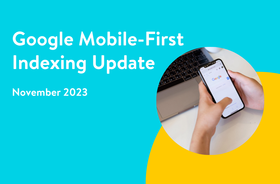
What You Need to Know About Google’s Mobile-First Indexing
On October 31, 2023, Google announced that its Mobile-First Indexing (MFI) update is now complete. This means that Google Search will now primarily use the mobile version of your website for crawling, indexing, and ranking.
Key Takeaways
-
Google predominantly uses the mobile version of content for indexing and ranking
-
Having a mobile-friendly website improves user experience and visibility
-
Ensure your mobile site has the same high-quality content as your desktop version
-
Use responsive design to adapt content across all devices
-
Optimise for speed, UX, and navigation on mobile to stay competitive
-
Mobile-first indexing affects all new and existing websites
Google has been moving towards mobile first indexing since 2016, so this is not a new change, but the update which has taken 7 years to complete, is now final.
Here’s a brief summary of the update and what it means for you:
What is Mobile-First Indexing?
MFI is a new way of indexing the web that prioritizes the mobile version of your website. Google has been moving towards MFI for several years, and it’s now the default way that they index all websites.
Why is Mobile-First Indexing important?
MFI is important because more and more people are using their mobile devices to access the web. In fact, over 60% of all web traffic now comes from mobile devices. By prioritizing the mobile version of your website, Google is ensuring that users are getting the best possible experience, regardless of what device they’re using.
What does Mobile-First Indexing mean for my business?
If you have a website, it’s important to make sure that the mobile version is up-to-date and mobile-friendly. If it’s not, you may notice a drop in your search rankings.
Some basic MFI health-checks:
- Make sure your website is responsive, so that it looks good and functions well on all devices including moble.
- Make sure your fonts, and buttons are large enough, and easy to tap on a mobile device.
- Avoid overloading your mobile pages.
- Make sure your website loads quickly on mobile devices.
What is the history of Google’s mobile first indexing?
Google’s Mobile-First Indexing (MFI) is a direct response to the rapid shift in internet usage, where mobile devices have overtaken desktops as the primary way users access online content. The journey towards this fundamental change began in 2015, when Google first announced its plans to prioritise mobile-friendly websites in search rankings. At the time, Google’s ranking system predominantly assessed the desktop versions of websites, even though more searches were being conducted on mobile devices. This mismatch often led to poor user experiences, as mobile users would encounter sites that weren’t optimised for smaller screens or touch navigation.
By 2018, Google started rolling out Mobile-First Indexing by default for new websites, meaning that the mobile version of a site would be the benchmark for ranking and indexing rather than the desktop version. For older sites, the transition was gradual, as Google continued to evaluate whether they were mobile-friendly before switching them to MFI. In 2020, Google accelerated the shift by announcing that all websites, regardless of their launch date, would be moved to Mobile-First Indexing by March 2021. However, due to the complexities some sites faced in making the transition, the full implementation was delayed until late 2023.
Today, Mobile-First Indexing is the default standard, ensuring that websites prioritise mobile usability, fast loading speeds, and responsive design. For businesses and website owners, particularly in Australia’s competitive digital landscape, adapting to MFI is critical for maintaining visibility in search results. Google’s emphasis on mobile-friendly experiences continues to shape Search Engine Optimisation / SEO strategies, reinforcing the importance of responsive design, structured data, and optimised performance for success in search rankings.
What is Mobilegeddon?
Mobilegeddon refers to Google’s Mobile-Friendly Update, which was rolled out on 21 April 2015. The term itself was coined by SEO experts and digital marketers ahead of the update, as speculation grew that it would have a significant impact on search rankings—particularly for websites that were not optimised for mobile devices.
Google first announced the update in February 2015, stating that it would prioritise mobile-friendly websites in mobile search results. This meant that sites with responsive design, fast loading times, and touch-friendly navigation would be favoured, while non-mobile-friendly sites could see a drop in rankings. The name “Mobilegeddon” was widely adopted within the SEO community, with tech and marketing publications such as Search Engine Land and Moz popularising the term.
Despite initial fears of widespread ranking collapses, the impact of Mobilegeddon was more gradual than expected. However, it marked a turning point in Google’s search algorithm, setting the stage for future mobile-first updates—including Mobile-First Indexing (2016) and the Page Experience Update (2021).
For Australian businesses, Mobilegeddon reinforced the need for mobile optimisation to maintain search visibility. Today, mobile-friendliness remains a key ranking factor, making it essential for websites to prioritise responsive design and fast-loading pages to succeed in Google search.
Is Mobilegeddon the same as Google’s mobile-first indexing?
No, Mobilegeddon and Google’s Mobile-First Indexing are not the same, but they are related. Both focus on improving mobile experiences, but they serve different purposes within Google’s search algorithms.
Mobilegeddon was the nickname given to Google’s Mobile-Friendly Update, which launched on 21 April 2015. This update prioritised mobile-friendly websites in mobile search results, meaning that sites that weren’t optimised for mobile screens could see a drop in rankings when users searched on mobile devices. However, this update still relied on Google’s traditional desktop-first indexing, where search rankings were determined primarily by a site’s desktop version.
Mobile-First Indexing (MFI), announced in 2016 and rolled out gradually from 2018 to 2023, was a more fundamental shift. Instead of using the desktop version of a website for ranking and indexing, Google began prioritising the mobile version of a site for all search queries, regardless of the device being used. This meant that websites with incomplete or poorly optimised mobile versions could suffer ranking losses across both desktop and mobile searches.
In short, Mobilegeddon was a ranking update for mobile search, while Mobile-First Indexing changed how Google indexes and ranks all websites. Both highlight the importance of mobile optimisation, but Mobile-First Indexing has a much broader and lasting impact on search engine rankings.
Google’s Mobile-First Indexing (MFI) is less about a single algorithm update and more about representing a fundamental shift in Google’s indexing and ranking processes. That said, several key algorithm updates paved the way for this mobile-first approach.
One of the earliest signals of Google’s mobile focus was the Mobile-Friendly Update (2015), often called “Mobilegeddon.” This update prioritised mobile-friendly websites in search rankings, encouraging businesses to optimise their sites for mobile users.
In 2016, Google officially announced Mobile-First Indexing, marking the transition to prioritising the mobile version of websites for ranking and indexing. The rollout began in 2018, with new sites being indexed under MFI by default. By March 2021, Google expanded Mobile-First Indexing to nearly all websites, with the final transitions completed in late 2023.
Another related algorithm update was the Page Experience Update (2021), which introduced Core Web Vitals as ranking signals, emphasising mobile performance factors such as loading speed, interactivity, and visual stability. This update reinforced the importance of a smooth mobile user experience.
While no single algorithm update is responsible for Mobile-First Indexing, Google’s continuous refinements—including Mobile-Friendly Ranking Factors, Core Web Vitals, and Page Experience Signals—ensure that mobile optimisation remains crucial for search rankings. For Australian businesses, keeping up with these updates is essential to maintaining visibility in Google search results.
How does mobile-first indexing affect your website?
Google’s Mobile-First Indexing (MFI) means that the search engine primarily crawls and ranks your website based on its mobile version, rather than the desktop version. This shift has significant implications for Australian businesses and website owners, as it directly impacts search visibility, user experience, and overall digital performance.
If your website is mobile-friendly, optimised for speed, and offers a seamless user experience on smaller screens, Mobile-First Indexing will likely work in your favour. A well-structured, responsive site can improve rankings, attract more organic traffic, and enhance engagement. However, if your mobile site is poorly optimised—featuring slow load times, intrusive pop-ups, or missing content compared to the desktop version—you risk lower search rankings and reduced visibility.
Key areas affected by MFI include content, page speed, and structured data. Google expects the mobile version of your site to have the same high-quality content, meta tags, and internal links as the desktop version. Additionally, mobile page speed is a crucial ranking factor, meaning that sluggish, unoptimised websites could see a drop in rankings. Mobile usability is also critical—issues like difficult navigation, unclickable buttons, or intrusive interstitials can negatively impact both rankings and user engagement.
For Australian businesses looking to maintain strong search engine performance, ensuring a mobile-friendly, fast, and accessible website is essential. Regular audits, responsive design, and performance optimisations will help safeguard your rankings in Google’s Mobile-First Indexing era.
What are the negative effects of mobile-first?
While Mobile-First Indexing (MFI) is designed to improve the search experience for mobile users, it can present challenges—especially for websites that haven’t fully adapted to mobile optimisation. Australian businesses that rely on desktop-first designs or have complex web structures may face ranking drops, user experience issues, and technical hurdles under this indexing approach.
One of the biggest negative effects is the potential loss of search rankings if your mobile site lacks the same content, structured data, or metadata as your desktop version. Google prioritises the mobile version for indexing, so if critical information is missing or not properly formatted for mobile, your site could lose visibility in search results.
Another key issue is performance and page speed. Mobile users expect fast-loading pages, and Google factors this into its rankings. If your mobile site is bloated with large images, unoptimised scripts, or slow-loading elements, it could lead to higher bounce rates and lower engagement, ultimately impacting conversions.
Additionally, some businesses may struggle with responsive design limitations. Websites with complex layouts, detailed tables, or interactive elements may not function as seamlessly on smaller screens. This can degrade the user experience and make navigating the site frustrating, discouraging visitors from staying on the page.
Finally, for businesses still relying on separate mobile sites (m.example.com) instead of a responsive design, MFI can create issues with inconsistent content, duplicate URL structures, and improper canonical tags—leading to SEO complications.
To mitigate these risks, Australian businesses should focus on responsive web design, mobile speed optimisation, and content parity across all devices. Regular audits and user experience testing are essential to ensure your site remains competitive under Mobile-First Indexing.
Comprehensive Guide To Mobile Search Engine Optimisation / SEO
Mobile SEO refers to the practice of optimising your web pages and content to achieve a higher ranking in search engine results pages (SERPs) when people search on mobile devices.
Mobile device usage has grown exponentially in the last decade, with Statista data showing three billion smartphone users worldwide as of 2021.
Further statistics show that mobile has become increasingly important in online sales and lead generation and Google is tweaking its algorithm to reflect these changes and prioritise pages that are mobile optimised.
In this article, we will examine the importance of mobile SEO for marketers and discuss what you need to do to optimise your website to become a mobile-friendly site.
Why is Mobile SEO important?
To say mobile SEO is important is a massive understatement.
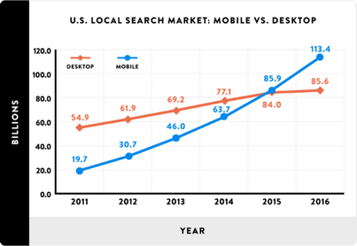
Look at the numbers: over 58% of all searches in Google are now done from a mobile device.

In real numbers, 27.8 billion MORE queries are performed on mobile than desktop in the United States alone.
Having a website that is mobile-friendly is essential for both strong SEO results and the user’s perception of your business. Data shows that 52% of customers are less likely to engage with a company because of a bad mobile experience.
Here are some further stats that prove mobile search engine optimisation is worth its weight in digital gold.
Internet users spend 70% of their time on mobile
With users now spending 70% of their time browsing the internet on a mobile device, site owners need to ensure their pages are optimised for both desktop and mobile devices.
By creating a mobile-friendly site, businesses will ensure their users have an enjoyable mobile experience, decreasing bounce rates and increasing return visits.
Businesses that fail to improve their mobile optimisation risk losing valuable customers and leads, and ultimately revenue.
74% of mobile users are more likely to return to a mobile-friendly website
Creating a positive, user-friendly experience for your site visitors leads to an increase in traffic from mobile devices, with 74% of users more likely to return to mobile optimised sites.
What is Google’s mobile-first index?
Based on the above facts, it’s no wonder that in 2018 Google launched the Mobile-First Index which overhauled its ENTIRE algorithm to focus on mobile.
For SEO services agencies and search engine optimisation pros and / or webmasters, this wasn’t a real surprise – it had been coming for a while.
In 2015, Google announced that mobile searches surpassed desktop searches for the first time.
A year later, Google unveiled its Mobile-Friendly Update (which many people called “Mobilegeddon”).
Here’s what Google said about it at the time:
“We’re boosting the ranking of mobile-friendly pages on mobile search results.
Now searchers can more easily find high-quality and relevant results where text is readable without tapping or zooming, tap targets are spaced appropriately, and the page avoids unplayable content or horizontal scrolling.”
Last year with the Mobile-First Index, Google left nothing in question. EVERY search is now a mobile search.
What does that mean? It means they rank search results based on the mobile version of the page ONLY – even if you’re searching via a desktop.
What Google is telling us here is crystal clear:
The future of search is mobile.
So if you’re not focusing on mobile SEO, now is the time to start.
Hold up – what is a mobile?
This is a valid question. Most people think of a mobile device as being a smartphone or tablet.
But Google does things differently, stating that: “when we speak of mobile devices, we generally do not include tablets in the definition”.
So, for Google, mobile means smartphones.
Not that you should get hung up on this, because mobile SEO is really about optimising your site for any device.
How to check if you have a mobile-friendly website
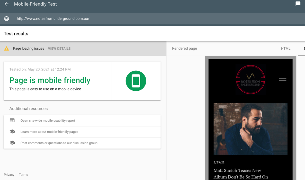
You’ll want to check how mobile-friendly your site currently is, so you can track your online digital marketing efforts. There are several tools on the market that can help with this, but a good place to start is Google’s mobile-friendly test. Simply type your URL into the search box and voila, Google will let you know if you have a mobile-friendly site. This tool also analyses whether your site is loading properly and highlights any specific issues you have with resources that are being blocked or redirected.
Marketers will also want to check whether their site is crawlable by search engines. “Crawling” is how search engines find and index your website content. If your content can’t be crawled it won’t show up in search engine results. The best way to check this is with Google Search Console.
To do this, you simply need to Log in to Google Search Console, Go to Crawl » Crawl Errors, and click on Smartphone. From here you will see any crawl errors on your mobile site.
How to configure your mobile site
Now you understand the why of mobile SEO, now it’s time to look at the how? When it comes to the initial stages of configuring your site for mobile devices, you have 3 options.
Separate URLs or the “M.” Configuration

With this configuration, marketers have two versions of their site, the ‘main’ desktop site and a second mobile site (“M.”), both with their own unique URLs. The site determines which device, either desktop or mobile, a visitor is using and then directs them to the URL optimized for that device.
While this setup used to be popular in mobile SEO in the past, but it was plagued with SEO issues due to the multiple URLs and need for complicated “rel=canonical” and “rel=alternate” tags.
The popularity of the Separate URLs configuration has dropped off as newer technologies have provided more efficient options.
Dynamic Serving
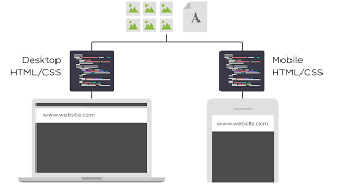
The second option for configuring your mobile site is dynamic serving.
When content is served dynamically, all of the content exists on the same URL. However, each site visitor is shown a different HTML/CSS depending on the device they’re using.
For example, if we visit https://www.onlinemarketinggurus.com.au/blog/types-of-keywords-keyword-research-seo/ on a desktop we are served a desktop version of the site, like so:
If we then navigate to the same page on a mobile device, we are still on the URL: “https://www.onlinemarketinggurus.com.au/blog/types-of-keywords-keyword-research-seo/”, however, we are served the mobile version instead:

While dynamic serving sites are certainly better for mobile SEO than separate URLs, it still has its drawbacks.
Dynamic servers often contain glitches that end up showing desktop versions of their site to mobile users.
Marketers and publishers also need to continually create new versions of their site for every new mobile device that enters the market or risk their site looking terrible on new smartphones.
Responsive design
Responsive design is the third, and most favourable option for configuring your site for mobile SEO.
Responsive design offers the ability to serve the appropriate version of your site to each individual user by tailoring your page’s layout and content to their device.
And it does this without the need for multiple URLs or different HTML for each machine.
- Responsive design is by the far the best option for mobile SEO for the following reasons:
- All content is on the same URL, making it easy to share on social media and other digital marketing platforms
- Reduces the need for canonical tags and minimises duplicate content issues
- Is extremely user friendly
- Google loves responsive web design and will rank such pages accordingly
7 best practices for Mobile SEO
What does good mobile SEO look like? How can you optimise your site for mobile search?
Let’s start by looking at some of the mobile SEO best practices and tactics. If you are not ticking off these best practices with your site, you have probably already noticed your rankings drop on Google.
Take a look:
1. Create a seamless user experience on mobile devices
This starts with a responsive website design, which means your site will adapt to the user’s device and screen size automatically.
But there are other elements too, like the menu design and calls to action, which all contribute to the user experience.
2. Mobile content
No more hiding content from mobile users. Google wants you to show the same content from your desktop on your mobile site.
3. Indexing
Google bots should be able to crawl and index all content formats, whether text, images or video, on mobile.
This means you should be using image alt tags and meta titles and meta descriptions and meta tags to their full potential.
4. Voice search
People perform voice search from their mobiles, so as voice search grows, you need to optimise your mobile site for voice search.
This means rethinking your keyword strategy to better focus on long-form keywords and questions.
Voice search is expanding literally as we speak, with tablets, smartphones and home assistant devices like Amazon’s Echo now using voice search technology.
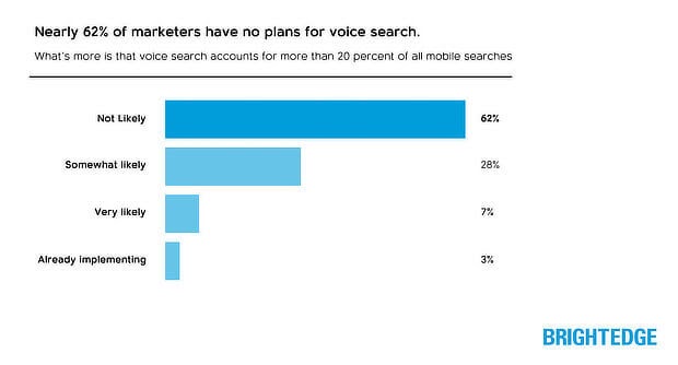
WIth 62 % of marketers currently stating they have no plans to implement a voice search SEO strategy, optimizing for voice search could put your business at a significant advantage when it comes to search rankings, particularly when it comes to local searches.
5. Fast load speeds
Page speed is a ranking factor for mobile sites, as Google made official in its Speed Update.
Page speed was already a ranking factor for desktop sites, so this is just bringing mobile to the same playing field. The faster, the better. Google recommends under 3 seconds.
Here’s why responsive web design is important for mobile pages:
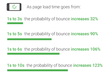
Image credit: Think With Google
6. All internal links and redirects work
This comes back to making sure your site is crawlable and creating a flawless user experience. Mobile SEO means making sure your links and redirects are up to scratch.
7. No interstitials
Interstitials are features like pop-ups and other interruptive advertising. For mobile users, these are annoying, frustrating and can disrupt the user experience causing visitors to exit without converting.
Google has started to disregard mobile pages with intrusive pop-ups that don’t add value to the page’s content.
What this all boils down to is creating a seamless and valuable user experience for your visitors on mobile.
How to check for mobile traffic
Once you have optimised your pages for mobile visitors, you’ll want to use Google Analytics to check your mobile traffic. If you have followed the above steps for mobile search engine optimisation, we bet you will see a dramatic increase in the number of mobile users visiting your site.
Here’s how to go about it:
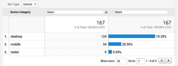
1. Login to Google Analytics, and navigate to Audience » Mobile. Here you will see a breakdown in the percentage of site visitors using desktop, mobile or tablet to visit your site.
2. From here, use the on-screen date detector to analyse how mobile traffic is affected by your mobile SEO strategy over time.
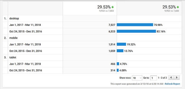
By revisiting google analytics on a regular basis you can follow how your mobile SEO strategy is tracking and tweak it as you go.
Isn’t this just the same as SEO best practice?
Yes and no. If you’re familiar with SEO and how it works, you may have noticed a few familiar items on the best practice list.
That’s because mobile SEO is very similar to regular SEO. There’s an emphasis on links, page load speeds and user experience.
But there are some significant differences.
One of these is voice search.
As voice search grows, the implications for mobile SEO will become more significant. But right now, it’s worth considering this for your mobile SEO strategy.
Another is location.
Google’s research shows that mobile searchers are increasingly using their location to perform “near me” searches.
Over two years, these searches grew a massive 500%.

This presents a massive opportunity for businesses to tap into mobile SEO and get in front of local audiences.
Mobile SEO tools
To find out if your site is mobile-friendly, there are a few tools you can use:
- Google’s Mobile-Friendly Test – this is a great place to start as it gives you a report on your site’s mobile friendliness, which you can use to make essential changes.
- Test My Site (another one from Google)
- Google’s PageSpeed Insights– See how fast your site loads, plus any fixes you can make to speed it up.
- Google Search Console– Check whether Google can successfully crawl your mobile site. If it can’t, your content won’t appear in SERPs.
- SEMrush– An alternative way to check indexation of your site.

Image credit: Optin Monster
Summary
Mobile SEO is a must for today’s businesses. It’s imperative for website owners and marketers to put mobile SEO first if they want to rank higher, boost traffic and increase conversions.
Without mobile SEO, your website won’t find the traction it needs for online success.
At OMG, our digital marketing team are mobile SEO experts. Contact us to start upping your mobile SEO game today.
What should I do next?
You don’t need to take any action. We already considered mobile when we audited your site and created your custom strategy. We’ll continue to monitor your website for any impact and advise you if we discover anything that needs to be actioned.
If you have any questions about digital marketing, MFI or would like to discuss the impact of this new update on your site, please don’t hesitate to contact us. Out expert team of Australian SEO agency gurus is here to help you make sure that your website is positioned for success.

About the Author
Danny Andrawes
Share


