


 1300 433 071


- Home
-

- Blog
-
- Website Optimisation Blogs
-
- Understanding Responsive Websites: History, Benefits, How-To & More
Understanding Responsive Websites: History, Benefits, How-To & More

What is a Responsive Website?
A responsive website is a type of website design that automatically adjusts its layout and content to fit different screen sizes, providing an optimal viewing and interaction experience for users across various devices, including desktops, laptops, tablets, and smartphones. The goal of a responsive website is to ensure that users have a seamless experience, no matter what device they are using, without the need for zooming in or horizontal scrolling.
Key Takeaways
-
A responsive website automatically adjusts its layout and content to fit different screen sizes, ensuring seamless browsing across desktop, tablet, and smartphone.
-
First coined by Ethan Marcotte in 2010, his A List Apart article introduced the responsive design principles of fluid grids, flexible images, and media queries.
-
Key steps to make your site responsive include using a responsive framework, flexible layouts, fluid images, mobile-optimised content, and testing across devices.
-
Responsive design works through fluid grids, media queries, fluid images, and responsive typography, ensuring layouts adapt and remain readable without zooming.
-
Benefits include improved SEO, better user experience, increased traffic, lower maintenance costs, and stronger brand credibility, all thanks to mobile-first design.
-
Google recommends responsive design as it supports single-URL structure, rapid load times, consolidated link equity, and avoids duplicate content; all vital for SEO
Responsive websites use a flexible grid system and CSS to adapt the layout to the user’s screen size. Elements like text, images, and menus resize and reposition, offering a multi-column layout on desktops and a single column on mobile devices for easier navigation.
A key benefit of responsive websites is that they eliminate the need for separate desktop and mobile versions, simplifying management and ensuring a seamless experience across all devices.
Responsive websites use media queries in CSS to adjust the layout based on screen size. For example, a three-column layout on large screens might switch to a single-column layout on smaller devices like smartphones, ensuring the site is easier to read and navigate without zooming or sideways scrolling.
Responsive websites use fluid images that scale according to screen size, ensuring they fit their containers and maintain a consistent appearance across devices without losing quality or causing layout issues.
In summary, a responsive website is a site that adapts its design and content to fit the screen size of the device it’s being viewed on. It offers a flexible and user-friendly experience across desktops, tablets, and smartphones by using a fluid layout, media queries, and scalable images. As mobile internet usage continues to grow, having a responsive website has become essential for businesses and website owners who want to reach a wider audience and provide the best experience for all users.
What is the First Responsive Website?
The first responsive website is generally credited to Ethan Marcotte, a web designer and developer, who coined the term “responsive web design” in a groundbreaking article published in 2010 on A List Apart. The article, titled “Responsive Web Design,” outlined a method for creating web layouts that could adapt to different screen sizes and devices, using a combination of fluid grids, flexible images, and media queries.
Ethan Marcotte didn’t necessarily design a specific website as “the first responsive website,” but his concept was applied to various projects following his article’s publication. The key idea was that websites should respond to the device they’re being viewed on, allowing for an optimal user experience, regardless of whether someone was viewing it on a smartphone, tablet, or desktop.
Important Milestone:

One of the early examples of responsive web design in action was the redesign of the Boston Globe website in 2011. This site is often cited as one of the first major real-world examples of a responsive website. The Boston Globe’s redesign used fluid layouts and CSS media queries to automatically adjust the website’s content based on the screen size, which was a significant shift in web design at the time.
How to Make Your Website Responsive?
Making your website responsive is crucial to ensuring that your visitors have a smooth and enjoyable experience, no matter what device they are using. The process of creating a responsive website involves a few key steps, which can range from adjusting your current design to completely redesigning your website.
5 tips to make your website responsive:
1. Use a responsive web design framework
A framework is a pre-made set of code that helps streamline the process of designing a website that works well on all screen sizes. Popular frameworks such as Bootstrap or Foundation come with built-in features and grid systems that allow your website’s layout to adapt to different screen sizes automatically. By starting with a framework, you save time and avoid having to reinvent the wheel when it comes to creating a responsive design.
2. Ensure that your layout is flexible
Traditional websites used fixed-width layouts, where the page design had a set width that didn’t adjust based on the screen size. This often caused problems when users tried to view websites on smaller devices, like smartphones. In contrast, a responsive design uses flexible grids and layouts that change in size depending on the screen dimensions. To achieve this, you can use CSS (Cascading Style Sheets) to create percentage-based widths, so elements such as images and text boxes automatically resize based on the device.
3. Ensure that your images and media are flexible
On a traditional website, images were often displayed at a fixed size, which could cause them to appear too large or too small on different devices. In a responsive design, images are often set to be fluid, meaning they automatically adjust to fit the screen size. You can use CSS techniques like the max-width: 100% property to ensure that images and videos scale properly on all devices. This helps prevent issues where images are too big for small screens or too small on larger displays.
4. Optimise your content for smaller screens
This involves adjusting the text size and layout to make sure that your website remains readable and easy to navigate, even on devices with limited screen space. For example, you may need to increase the font size for smaller devices or adjust the spacing between lines of text to make it more readable. You might also need to hide certain elements on smaller screens to ensure that your website remains simple and user-friendly. For instance, navigation menus might need to be condensed into a hamburger menu or hidden behind icons for mobile users.
5. Test the website across multiple devices and screen sizes
This step is crucial to catching any issues that might arise and ensuring that your website provides a seamless experience for all users. You can use developer tools built into browsers like Google Chrome to simulate how your website will appear on various devices. It’s also important to test your site on real devices to check for any performance or usability issues that might not be evident in a simulation.
making your website responsive involves using frameworks, flexible layouts, responsive images, optimising content, applying media queries, and thoroughly testing across devices. These steps help ensure that your website is accessible, functional, and user-friendly for visitors on any device. While it may take some time and effort to convert your website into a responsive design, the long-term benefits for SEO, user engagement, and overall website performance make it well worth the investment.
How Does Responsive Web Design Work?
Responsive web design works by using a combination of flexible grid layouts, fluid images, and media queries to ensure that a website adapts seamlessly to different screen sizes, from desktops to tablets and smartphones. It allows a single website to provide an optimal viewing experience across a wide range of devices, without the need for separate versions of the site for mobile and desktop users. Let’s break down how responsive design actually functions to make websites mobile-friendly and adaptable.
What is a Flexible Grid System?
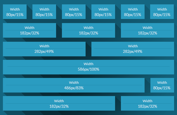
The first key concept behind responsive design is the flexible grid system. Instead of using fixed-width designs, where the size of content is set to a specific pixel width, a flexible grid layout uses percentages. This means that the size of elements such as text boxes, images, and columns is determined in relation to the size of the screen or the container they’re in. For example, a column on a desktop might take up 50% of the screen width, but on a mobile device, that same column might adjust to 100% of the screen width, making it easier to read and navigate. This flexibility ensures that content fits neatly on any screen size, providing a smooth user experience no matter the device.
What are Fluid Images and Media in Responsive Site Design?
Another important component of responsive design is the use of fluid images and media. In traditional web design, images were often set to specific pixel sizes, which could lead to images being too large for smaller devices or too small on larger screens. Responsive web design solves this issue by making images fluid, meaning they automatically adjust to fit the width of the container they are in. This is usually achieved by setting the max-width: 100% property in CSS, which makes sure that images scale down proportionally when viewed on smaller screens. For example, an image might take up the full width of the screen on a smartphone, but be much smaller when viewed on a large desktop display. This ensures that the images always look crisp and properly sized, no matter what device they are viewed on.
What are Media Queries?
Media queries play a crucial role in responsive design. Media queries are CSS techniques that allow different styles to be applied based on specific conditions, such as the screen width, height, or resolution of the device. With media queries, web designers can specify different styles for devices with various screen sizes, ensuring that the layout adapts to fit the device’s screen. For instance, a media query might tell the website to display a multi-column layout on desktops, but switch to a single-column layout on mobile devices for easier reading. Media queries allow web designers to control how content is displayed at various breakpoints, which are predefined screen sizes where the layout needs to change to provide an optimal viewing experience.
What is Responsive Typography?
Additionally, responsive typography is an essential feature of responsive web design. This means that text sizes can be adjusted depending on the size of the screen, ensuring that the text is legible no matter what device is being used. On a large desktop screen, text might appear larger, while on a mobile phone, it could be resized to fit neatly within the smaller screen without requiring the user to zoom in. Responsive typography can also include adjusting line spacing and font styles to improve readability on different screen sizes.
What Does Single URL Structure Mean for Responsive Web Design?
Responsive web design also makes use of single URL structure. Rather than creating separate versions of a website for mobile and desktop users, responsive design uses the same URL for both. This is important for SEO, as search engines like Google prefer a unified website with one set of content. With a responsive design, there is no need for a separate mobile version of the website, and all users are directed to the same URL, whether they are on a phone, tablet, or desktop. This not only simplifies site management but also prevents issues with duplicate content, which can negatively impact SEO.
What Does “Performance-Oriented Responsive Design” Mean?
Finally, responsive design is performance-oriented, meaning that it helps optimise website performance across different devices and network conditions. A responsive site typically loads faster on mobile devices by only loading the necessary resources, such as images and scripts, for the specific device. For instance, large images intended for desktop devices may be replaced with smaller versions on mobile devices, which helps to reduce load times. Faster loading times improve user experience, reduce bounce rates, and contribute to better search rankings.
In summary, responsive web design works by combining flexible grids, fluid images, media queries, and responsive typography to ensure that a website automatically adjusts to fit any screen size. By using the same code for all devices and optimising the site’s layout, images, and content, responsive design provides a seamless and user-friendly experience across desktops, tablets, and smartphones. It’s a modern and effective approach to web design that improves user engagement, boosts SEO, and ensures your website looks great and functions properly, no matter how it’s being accessed.
5 Main Benefits of Having a Responsive Website
Having a responsive website offers several significant benefits that can positively impact both your website’s performance and your business’s success, such as:
1. Improved SEO
In today’s digital landscape, search engines, especially Google, prioritize mobile-friendly websites when determining search rankings. This is largely due to the increasing number of users who access the internet through mobile devices like smartphones and tablets. With Google’s shift to mobile-first indexing, where mobile versions of websites are given preference in search rankings, having a responsive design is crucial for maintaining or improving your site’s visibility. A responsive website ensures that your site is optimised for all screen sizes, which can help you rank higher in search search engine results page / SERPs and as a result, attract more visitors and drive more organic search traffic to your website.
2. Better user experience
Users today expect fast websites that load quickly and be easy to navigate on any device, whether it’s a desktop, tablet, or phone. A responsive website automatically adjusts to fit the size of the screen it’s being viewed on, ensuring that visitors don’t have to zoom in or scroll horizontally to view content. This makes your site more accessible and enjoyable for users, which in turn encourages them to stay longer on your pages. A positive user experience is vital SEO rankings, keeping visitors engaged and can lead to more conversions, whether those are in the form of sales, sign-ups, or other actions.
3. Increase traffic
As more people use mobile devices to browse the internet, it’s essential that your website is optimised for mobile use. If your site isn’t responsive and doesn’t display well on smartphones or tablets, visitors may bounce off your site quickly and leave to go to a competitor’s website that provides a better experience. This can result in a higher bounce rate, which is detrimental to your SEO and overall website performance. On the other hand, by offering a smooth experience across all devices, you are more likely to attract and retain users, ultimately leading to increased traffic.
4. Cost-effective and easier to maintain
In the past, many businesses created separate versions of their websites for desktop and mobile users. This required more time and resources to develop, update, and maintain both versions. A responsive website solves this problem by using a single design that adapts to all devices, meaning there is only one version of your site to manage. This reduces maintenance costs and makes your website more efficient to update, as any changes made will automatically apply to both the desktop and mobile versions.
5. Helps build brand credibility and trust
As more users access websites via mobile devices, the expectation for mobile-friendly websites has increased. If your website is difficult to navigate on a phone or tablet, users may perceive your business as outdated or unprofessional. A responsive design, on the other hand, shows that you are up to date with modern web design trends and are committed to providing the best experience for your visitors, regardless of how they access your site.
Why is a Responsive Website Important for SEO?
A responsive website is not just important for user experience; it is also critical for your Search Engine Optimisation (SEO) strategy. In fact, responsive design plays a significant role in improving your website’s ranking in search engine results, especially with Google’s shift towards mobile-first indexing.
Google’s mobile-first indexing means that the search engine primarily uses the mobile version of a website for ranking and indexing. This shift was driven by the increasing use of mobile devices to browse the web. If your website is not responsive and doesn’t work well on mobile devices, it can lead to a poor user experience, which can affect your rankings. Google wants to provide the best possible experience for users, so websites that are mobile-friendly and responsive are more likely to rank higher.

Additionally, a responsive website helps reduce bounce rates, which is another factor that affects SEO. When visitors land on your website, they expect it to work well on their device. If they have to zoom in, scroll sideways, or struggle to navigate your site, they are more likely to leave quickly, increasing your bounce rate. A responsive website ensures that your site looks good and functions well across all devices, keeping users engaged and reducing bounce rates.
Faster load times are another important consideration for SEO. Responsive design often leads to faster page loading times because images are resized automatically and the layout adjusts to fit the screen. Google considers page speed as a ranking factor, so faster websites are more likely to rank higher in search results.
A Responsive Website is Extremely Important for SEO for 8 Main Reasons:
Mobile-Friendly Design:
- Google prioritises mobile-first indexing, meaning that Google predominantly uses the mobile version of a site for ranking and indexing. A responsive website ensures that your content, images, and overall layout adapt seamlessly to mobile devices.
- Without a responsive design, your website may perform poorly on mobile devices, which can result in a negative user experience and lower rankings in search results.
Improved User Experience (UX):
- Google considers user experience as a ranking factor, and a responsive design contributes to a better UX by providing an optimised, seamless experience across all devices (desktop, tablet, smartphone).
- With responsive design, users don’t have to zoom in or scroll horizontally to view content, which can reduce bounce rates. A lower bounce rate (when visitors quickly leave your site) is often associated with better user engagement, which can positively influence SEO.
Faster Load Times:
- Responsive websites typically load faster because they adapt the size of images and content based on the device and screen size. Faster load times are crucial for both user satisfaction and SEO.
- Google considers page speed as a ranking factor, and faster websites tend to rank higher in search results.
Avoid Duplicate Content Issues:
- If you have separate mobile and desktop versions of your website (often done through dynamic serving or separate URLs), search engines may consider this as duplicate content (e.g., if the same content is available under different URLs, one for mobile and another for desktop).
- With responsive design, all content is served under a single URL, avoiding this issue and making it easier for search engines to crawl and index your site.
Google’s Recommendations:
- Google officially recommends responsive design for websites because it helps search engines efficiently crawl and index content. Googlebot prefers the consistency of a single URL for all devices, making it easier to determine the relevance of your site and improving the accuracy of search rankings.
Better Link Equity:
- In a responsive website, there’s only one version of each webpage, which means that link equity (the value passed through backlinks) is consolidated and not split between mobile and desktop versions of your site.
- This ensures that external links pointing to your site contribute to a stronger overall domain authority, helping improve rankings across both desktop and mobile search results.
Increased Traffic:
- Mobile internet usage has surpassed desktop usage in many regions, meaning that a large portion of your audience will be using mobile devices. A responsive design ensures your site is easily accessible to all users, leading to increased organic traffic.
- Google’s mobile-first approach also affects search rankings on mobile search results, so a responsive design helps ensure your site performs well in mobile searches.
Improved Social Sharing and Engagement:
- Social media websites that are great marketing and advertise platforms, especially mobile-based ones, make up a significant portion of web traffic. When users share content from a responsive website, the shared links are consistent and will lead to a properly formatted page across different devices.
- Higher engagement due to mobile optimisation may also indirectly benefit your SEO, as Google rewards content that is frequently shared and interacted with.
Creating a responsive website is not just about making your site look good on all devices—it directly influences SEO by improving mobile accessibility, user experience, load times, and content indexing. By ensuring your website is responsive, you align with Google’s best practices, reduce the risk of SEO issues (like duplicate content), and ensure a better experience for users, which can ultimately boost your website’s ranking in search results.
Responsive vs Reactive Websites:
When designing a website, one of the key decisions you’ll face is whether to build it as a responsive or reactive website. While both types of websites aim to offer an optimal viewing experience across different devices, they operate in different ways and achieve their goals using distinct methods. To make an informed decision about which approach works best for your website, it’s essential to understand the core differences between responsive and reactive websites.
Definition of Responsive Websites
A responsive website is one that adapts its layout and content according to the size of the screen. This approach uses flexible grids, media queries, and CSS rules to ensure that the site is usable and accessible across various devices, from desktops and laptops to smartphones and tablets. A responsive website automatically adjusts based on the device’s screen resolution, offering an optimal viewing experience without the need for zooming or horizontal scrolling.
Responsive web design typically involves setting breakpoints at which the layout changes to suit different screen sizes. For example, a multi-column design on a desktop might shift to a single-column layout on mobile phones for better readability and navigation. The key to responsive design is that it ensures content and layout are proportionate and reflow appropriately across devices.
Definition of Reactive Websites
A reactive website takes a different approach to user experience. Instead of changing the design based on the screen size, a reactive website reacts to specific user actions or interactions. The term “reactive” usually refers to how the website responds or reacts to the user’s behavior, such as clicks, scrolls, or hover actions.
A common example of a reactive website feature is a menu or a button that only appears when the user clicks or hovers over a specific area of the page. These sites are often built using JavaScript or other interactive technologies, which provide dynamic content updates and change how the user interacts with the site. Reactive elements on a website can create a more engaging experience, as the content responds to the user’s input rather than simply adjusting for screen size.
Main Differences Between Responsive and Reactive Websites
-
Layout and Adaptation:
- Responsive Websites: The layout of a responsive website automatically adjusts based on the size of the user’s device. The design reconfigures itself depending on whether the visitor is using a smartphone, tablet, or desktop, ensuring that the site is easy to navigate and visually appealing on any screen.
- Reactive Websites: While reactive websites do not adjust their layout for different screen sizes, they focus on reacting to user interactions. Features like drop-down menus, pop-up boxes, and dynamic content are triggered based on user actions, rather than changes in the screen size.
User Experience:
- Responsive Websites: The main goal of responsive web design is to provide a seamless, user-friendly experience across all devices. By adapting the content layout to suit the screen size, users can enjoy consistent navigation and readability whether they are browsing on a phone or a computer.
- Reactive Websites: Reactive websites aim to create a more interactive experience. These websites dynamically respond to user actions, such as scrolling, clicking, or hovering, which makes the experience feel more engaging and personalised. However, the layout itself may not change based on device size.
Technology and Implementation:
- Responsive Websites: Responsive design relies heavily on CSS techniques like flexible grids and media queries. This allows the website to adapt to different screen resolutions without requiring multiple versions of the site. It’s focused on ensuring that content is displayed properly across different devices.
- Reactive Websites: Reactive web design often uses JavaScript, AJAX, and other technologies to enable interactive elements on a page. These websites rely on user input or actions to trigger changes in the site’s content or appearance.
Performance:
- Responsive Websites: Since a responsive website adjusts its layout and content automatically based on the screen size, it often requires more CSS and design work upfront. However, once set up, a responsive website generally offers great performance across a wide range of devices.
- Reactive Websites: Reactive websites tend to have dynamic content that is triggered by user interaction. While this can create an engaging experience, it may require more server-side interactions or JavaScript processing, which can sometimes slow down the website, especially if the features are not optimised.
SEO Considerations
- Responsive Websites: Google recommends responsive design for mobile-friendly websites because it allows for a single URL that serves content to all devices. This means that all inbound links, content, and traffic are directed to one site, which is beneficial for SEO. Since responsive websites are designed to work seamlessly across devices, they improve user experience and reduce bounce rates, which can contribute positively to search engine rankings.
- Reactive Websites: While reactive elements can enhance the interactivity of a website, they don’t directly improve the layout for different screen sizes. If a reactive site isn’t responsive or optimised for mobile users, it may suffer in terms of SEO performance, as search engines may struggle to index or properly display content for mobile users. This is particularly true if dynamic content isn’t correctly loaded or displayed on mobile devices.
When to Use Responsive vs. Reactive Web Design
- Responsive Websites: Responsive design is ideal if you want your website to provide a seamless user experience across multiple devices without the need to create separate versions of your site for different platforms. It’s the preferred method for ensuring that your website works well on phones, tablets, and desktops and that your content is accessible to a wide range of users.
- Reactive Websites: If your website focuses heavily on user interaction, such as e-commerce sites, applications, or websites with complex features like interactive forms, reactive design might be beneficial. Reactive design allows for personalised and engaging user experiences by responding to how users interact with the site. However, it’s important to ensure that the website is also optimised for various screen sizes to avoid issues for mobile users.
While both responsive and reactive websites aim to improve the user experience, they approach it in different ways. A responsive website adjusts its layout and design based on screen size, ensuring an optimal experience on all devices. In contrast, a reactive website is more focused on responding to user interactions, such as clicks or scrolling, to enhance engagement. Ultimately, many modern websites combine both responsive and reactive design techniques to offer a dynamic, interactive, and user-friendly experience across devices and platforms.
Responsive Sites vs. Fixed Websites
When designing a website, one of the most important decisions you’ll need to make is whether to use a responsive or fixed design. Both types of websites are structured to display content, but they differ significantly in how they handle different screen sizes and user devices. Understanding the differences between these two approaches is essential for creating a website that provides the best experience for your users. Let’s break down what responsive and fixed websites are, how they work, and which might be better for your needs.
What is a Fixed Website?
A fixed website (also known as a static website) uses fixed-width design elements. The layout is set to a specific width (in pixels) and does not change or adjust depending on the size of the user’s screen. This means that when a user accesses the website on a smaller device, such as a smartphone, they may have to scroll horizontally to see the entire content or zoom in to read text properly. On larger screens, the fixed-width layout remains the same, which could result in a lot of unused space on wide monitors.
Fixed websites rely on a predefined grid and layout, meaning the width of the content stays constant regardless of the device being used to view it. This can result in poor user experiences for mobile users, as the website may not be optimised for smaller screens.
Key Differences Between Responsive and Fixed Websites:
1. Layout Flexibility
- Responsive Websites: The layout of a responsive website changes based on the size of the screen. Elements such as images, text, and navigation menus resize or adjust their placement to fit the available space. This ensures that the content remains legible and accessible on all devices, from desktops to smartphones.
- Fixed Websites: The layout of a fixed website stays the same regardless of screen size. This can lead to problems when users access the site on smaller devices, as the content might be too small or require zooming to read.
2. Mobile-Friendliness
- Responsive Websites: Responsive websites are mobile-friendly by design. They automatically adapt to smaller screens, providing a user-friendly experience without the need for zooming or scrolling sideways. This is crucial, as mobile traffic accounts for a large portion of internet usage today.
- Fixed Websites: Fixed websites are not inherently mobile-friendly. On smaller screens, users may experience difficulty reading text, navigating the site, or viewing images. These sites may require zooming or horizontal scrolling, which can be frustrating for users.
3. Design Customisation
- Responsive Websites: A responsive design allows for greater customisation and flexibility. Developers can create different styles for various screen sizes using media queries. This means you can design unique layouts for smartphones, tablets, and desktops, ensuring the best experience for each device.
- Fixed Websites: Fixed websites offer little customisation for different screen sizes. They may look great on a desktop, but the experience on mobile or tablet devices will often be subpar due to the lack of adaptability.
4. SEO and User Experience
- Responsive Websites: Google and other search engines prefer responsive websites because they provide a better user experience across all devices. With responsive design, all traffic is directed to a single URL, which makes it easier to manage and optimize for search engines. Additionally, responsive websites often have lower bounce rates because users can navigate the site more easily.
- Fixed Websites: Fixed websites can harm SEO if they are not mobile-optimised. Search engines tend to rank mobile-friendly sites higher because of the growing number of users browsing on mobile devices. If a fixed website is not mobile-friendly, it may experience higher bounce rates, lower user engagement, and lower search engine rankings.
5. Maintenance:
- Responsive Websites: Responsive websites are easier to maintain in the long run because they use a single set of code and work across all devices. Updates made to the website only need to be applied once, and they will automatically be reflected across all screen sizes.
- Fixed Websites: Fixed websites may require separate versions for desktop and mobile devices, making maintenance more complicated. If the site has different versions for mobile and desktop, changes need to be made to each version, which can be time-consuming and inefficient.
6. User Experience:
- Responsive Websites: Responsive websites offer a more consistent and enjoyable user experience across all devices. Since the layout adapts to the device, users can navigate, read, and interact with the content without any difficulty. This leads to higher user satisfaction and engagement.
- Fixed Websites: Fixed websites may offer a poor user experience on mobile devices because users are forced to zoom in or scroll horizontally. This can be frustrating and lead to a higher bounce rate as users abandon the site in search of a better experience.
Responsive vs Fixed: Which One is Better
When choosing between a responsive or fixed website, consider your audience and their devices. With rising mobile usage, a responsive website ensures accessibility, user-friendliness, and SEO benefits across all devices.
On the other hand, a fixed website might still be useful for simple websites with a limited target audience that primarily access the site via desktop computers. However, with the growing importance of mobile devices, fixed websites are generally less effective for modern web usage.
The key difference is that responsive websites adapt to any screen size, while fixed websites have a set layout that doesn’t adjust for mobile. Responsive design offers a better user experience across desktops, tablets, and smartphones, making it the preferred choice for businesses.
A fixed website has a static layout with a set size, usually in pixels, that doesn’t adjust for different screen sizes. While it may look good on desktops, it can be hard to use on smaller devices, requiring users to zoom or scroll horizontally.
A responsive website uses fluid layouts that adjust content based on screen size. For instance, it switches from a multi-column to a single-column layout on smaller screens, making the content easy to read and interact with. This flexibility is why responsive design is now the standard.
What is a Fluid Website?
A fluid website, also known as a liquid layout, is a type of web design that adjusts the layout of a webpage based on the size of the screen or browser window. Unlike fixed-width websites, which have a set width that doesn’t change, fluid websites use percentage-based widths, meaning they adapt and stretch or shrink to fill the available screen space.
This design approach ensures that a website looks great on any device, from desktops and laptops to tablets and smartphones. The content flows smoothly across different screen sizes, providing a more responsive and user-friendly experience.
Key features of a fluid website:
- Responsive design: It automatically adjusts the layout to fit various screen sizes.
- Improved user experience: Fluid websites are easier to navigate on any device.
- Better accessibility: Users can view the content without having to zoom in or out.
A fluid website is essential in today’s mobile-first world, where users access websites from a wide range of devices with different screen sizes.
What Are The Key Differences Between Fluid and Responsive Websites
When building a website, there are a variety of design approaches you can use to ensure your site looks good and functions well across different devices. Two of the most common design strategies are fluid websites and responsive websites. While both aim to create a user-friendly experience on all devices, there are key differences in how they work and how they adapt to various screen sizes. Understanding these differences can help you decide which approach is best for your website.
Layout and Structure
The difference between fluid and responsive websites lies in how the layout adapts to different screen sizes.
- Fluid Websites: A fluid website uses a layout based on percentages rather than fixed pixel values. This means that the width of the elements (like columns, images, and text blocks) is relative to the screen size or the container they are in. For example, if an image is set to 50% of the container width, it will take up half of the screen, regardless of the device size. As the screen size changes, the layout expands or contracts, but the elements retain their relative proportions. This gives the website a more flexible, dynamic layout.
- Responsive Websites: On the other hand, a responsive website uses a combination of flexible grids, media queries, and CSS rules to adjust the layout based on the screen size. A responsive website can have multiple layouts that change based on specific breakpoints (such as when the screen width is 600px, 768px, or 1024px). At each breakpoint, the layout adapts to provide the best viewing experience, often switching from a multi-column layout on desktop to a single-column layout on mobile devices. This approach ensures that the website is not just scaling content but adjusting the design to fit the device.
Device Flexibility
While both fluid and responsive websites adapt to different screen sizes, they do so in different ways.
- Fluid Websites: Fluid websites are good for adjusting content proportionally, but they don’t have the same level of control over how content behaves on different devices. For example, on very small screens like smartphones, a fluid website might look good at first, but the content may become too small or hard to read. Because fluid websites use percentages for layout, they can struggle to optimise content for devices with very different screen sizes, especially when it comes to small mobile screens or large desktop screens.
- Responsive Websites: Responsive websites, however, offer more control and flexibility when it comes to different devices. Thanks to media queries, a responsive site can have different layouts and styles applied based on the screen size, which means that you can design specific versions of your site for smartphones, tablets, and desktops. For example, you might have a layout with large images and multiple columns on desktop, but the same content may be rearranged into a simple, single-column layout on mobile devices. This gives you more precise control over the user experience across a wide range of devices.
Design Considerations
When it comes to design flexibility and customisation, there are differences in how fluid and responsive websites handle content.
- Fluid Websites: Fluid websites tend to rely more on proportionality, which can lead to a more uniform design that looks similar across all devices. However, while this is great for certain types of content, such as images or text, it can create problems when it comes to maintaining usability on devices with very different screen sizes. For example, on very large or very small screens, the website elements may become stretched or too small to read comfortably, which can negatively impact the user experience.
- Responsive Websites: Responsive websites offer more freedom when it comes to customising the design. Because responsive design uses breakpoints, you can tailor the layout and elements for each specific device, ensuring that images, text, and other content display optimally. You can create a design that looks great on desktop screens and then reformat it for mobile screens to ensure that it’s easy to navigate and read on smaller devices. This makes responsive design more versatile when dealing with different screen sizes and provides a better overall user experience.
SEO Considerations
Both fluid and responsive websites can be optimised for SEO, but responsive design has certain advantages over fluid design.
- Fluid Websites: Fluid websites do not always provide the same level of control over the user experience on smaller devices. While fluid layouts ensure that content adapts proportionally, the lack of specific device-based layouts may cause issues with text size, images, and navigation on certain screen sizes. If a fluid website isn’t optimised for mobile, users may need to zoom in or scroll horizontally, which can lead to higher bounce rates and a lower user experience score. This can hurt the site’s search engine ranking, as Google and other search engines prioritise mobile-friendly websites in their rankings.
- Responsive Websites: Responsive websites are generally better for SEO because they provide a tailored experience on different devices. Google rewards websites that are mobile-friendly, and responsive design makes sure that your website automatically adjusts its layout, content, and images to fit all screen sizes. Since responsive websites use a single URL and don’t require separate mobile versions, it’s easier for search engines to index the content and provide better visibility in search results.
Ease of Maintenance
Maintaining a fluid or responsive website can vary in terms of complexity.
- Fluid Websites: Fluid websites are relatively simple to set up because they rely on percentages rather than complex layout changes. However, they can be difficult to maintain, especially as the site grows. As new devices with different screen sizes are released, fluid websites may need to be manually adjusted to accommodate the changes, which can be time-consuming.
- Responsive Websites: Responsive websites may require more initial setup because they involve defining specific breakpoints and creating different layouts for various screen sizes. However, once set up, responsive websites are generally easier to maintain. With responsive design, updates to the website can be made once, and they will automatically apply across all devices. This reduces the need for separate mobile and desktop versions and ensures that the website remains consistent across platforms.
The key differences between fluid and responsive websites lie in their layout and how they handle different screen sizes. While fluid websites use percentages to create a flexible layout, responsive websites use a combination of flexible grids, media queries, and breakpoints to create device-specific layouts that optimise the user experience. Responsive design provides more control, flexibility, and customisation, making it the preferred choice for most modern websites. Fluid websites can still be useful in certain cases, but for greater control over design and a better overall user experience, responsive web design is typically the way to go.
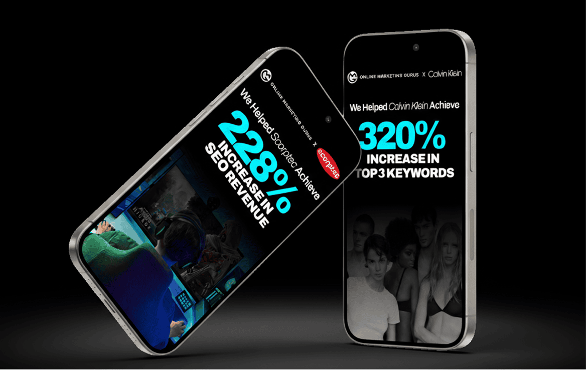
From Responsive Design to Real Results. Partner With Online Marketing Gurus.
A responsive website is essential for any modern website that wants to provide a great user experience and perform well in search engine rankings. By using fluid layouts, flexible images, and media queries, you can create a site that looks great and works well on any device, from desktops to smartphones. With Google’s focus on mobile-first indexing and the increasing use of mobile devices for web browsing, responsive design is not just a trend—it’s a must.
Whether you’re building a new site or updating an old one, our SEO services agency can help you implement a performance-driven, SEO-optimised responsive design that not only looks amazing, but actually ranks. From implementing in-depth technical SEO to design strategy, to SEM marketing such as managing pay-per-click / PPC advertising campaigns to creating email marketing campaigns that convert we’ll make sure your website doesn’t just adapt; it thrives.
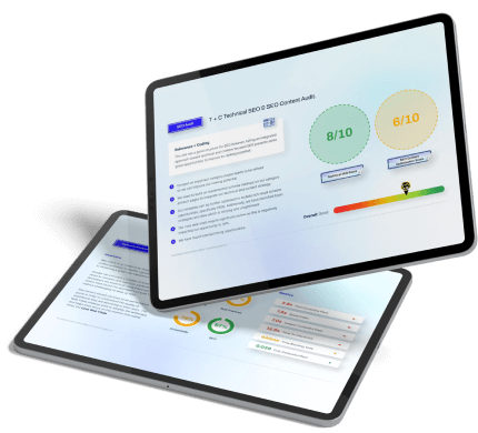
Reach out to one of our Digital Marketing gurus today and claim your free, in-depth professional website audit and strategy session; and take the first step toward dominating your digital space.

About the Author
Andrew Raso
Share


