


 1300 433 071


- Home
-

- Blog
-
- How to Guide Blogs
-
- UX and SEO: Understand How Design Can Affect Your SEO Performance
UX and SEO: Understand How Design Can Affect Your SEO Performance
A good user experience / UX equals good SEO
UX and SEO rely on each other more than ever before. Delight your site visitors with a speedy, well-designed and developed website, and they’ll stay on your page longer (and even keep coming back). Best of all, Google will reward you with a nice little bump in search results. Deliver a poor user experience, however, and you can say goodbye to your hard-earned organic traffic and your rankings as google will penalize your website.
Key Takeaways
-
A strong user experience improves SEO by increasing dwell time and reducing bounce rates.
-
Google ranks websites using UX signals like RankBrain, Mobile-Friendliness, and Core Web Vitals.
-
Clear navigation, structured pages, and easy-to-follow site design help both users and search engines.
-
Fast-loading pages with optimised code and minimal font use contribute to better rankings.
-
Mobile responsiveness and features like tabbed content or infinite scroll enhance usability and SEO.
There’s no way around it.
User experience, or UX, and search engine optimisation are more intertwined than ever.
But in 2022, good UX goes beyond just having a good-looking website. There are some specific factors that you need to pay attention to when designing your site if you want to optimise it for search and for customers.
That’s what we’re going to talk about in this post.
We break down:
- How UX affects SEO
- UX signals Google looks for to rank websites
- How to use UX to improve SEO performance
The link between UX and SEO, along with the specific signals that Google looks for when ranking websites. You’ll also get actionable insights on how to use UX to improve your site’s SEO performance and maximise online visibility amongst your target market.
Ready? Let’s go.
How Does UX Affect SEO?
The fundamental way that user experience and SEO work together boils down to one simple fact: Search engines are more likely to rank you if they see that people don’t immediately hit the back button after clicking on your site.
To understand why, you need to first look at how search engines like Google work.
Google’s primary goal is to provide users with the most helpful result for their search queries. Google wants people to use its search engine over and over again, and that won’t happen if it’s driving people to subpar websites that don’t work well or aren’t easy to navigate.
That’s where user experience comes in.
Well-designed websites that offer clear navigation, work well on all devices, and don’t obscure their content behind ads deliver a better overall user experience. As a result, people stay on the web page for longer and are more likely to engage with the content.
From Google’s standpoint, these sites trump other sites where users leave the page immediately after landing on it. This is because that page clearly wasn’t what people were expecting to see when they clicked on the result.
That’s why creating a positive user experience is key to achieving good search performance.
A website that’s frictionless and that people enjoy using is one of the fundamental ways of building popularity with users. From attracting links, increasing page views, improving conversion rates and revenue, you can’t lose by focusing on the user experience.
And best of all, when you improve your UX, you naturally improve your SEO because Google will see your website as useful, relevant and helpful.
3 Main UX signals that Google looks for when ranking websites:
Google has over 200 ranking factors that it considers when deciding which websites to rank at the top of search results. These cover a bunch of different elements including crawlability, indexability, authority and expertise — but a good portion is dedicated to the overall user experience.
These UX ranking factors can broadly be split up into three categories: RankBrain, Mobilegeddon, and the most recent Core Web Vitals update.
1. RankBrain
RankBrain is one of the most important ranking factors in Google’s algorithm.
This machine learning algorithm looks at a variety of website behaviour metrics, including bounce rate, clickthrough rate, dwell time and pages per session. It then uses these signals to measure a user’s satisfaction with search results, and how useful the results were to their query.
Here’s how this ranking factor works in a nutshell:
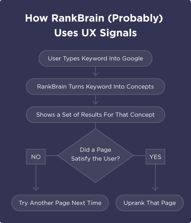
Image source: Backlinko
If a user spends a lot of time reading your content and clicking on internal links to different pages, RankBrain will tell Google that searchers are happy with this search result. Google will then be more likely to display that result in the future for relevant keywords because it’s been proven that users find this information helpful.
On the other hand, if a user clicks on a search result and then clicks away a few seconds later, RankBrain tells Google that this web page isn’t relevant to the searcher’s query. In this case, Google will be less likely to display that page because it’s clearly not delivering a good user experience.
2. Mobilegeddon
Have you ever run a Google search on your smartphone, clicked on a result, then instantly navigated away because the website was insanely difficult to use on a small screen?
You’re not alone.
We spend more than 70% of our total online time browsing content on our smartphones. What’s more, almost 3 in 4 internet users say they would be more likely to return to a website if it was mobile-friendly.
Google KNOWS that mobile-friendliness is extremely important to users. That’s why it rolled out a mobile-first indexing update a few years ago, which predominantly uses the mobile version of a website for indexing and ranking search results.
This update soon became known as ‘Mobilegeddon’. A lot of websites lost their visibility in search results because their UX simply wasn’t up to scratch for mobile users.
Today, a website’s mobile-friendliness is another key way that Google measures good UX. If your site doesn’t load quickly or your web design isn’t optimised for mobile SEO, it’s probably going to end up affecting your overall ranking in search results (not to mention the rest of your digital marketing efforts).
3. Core Web Vitals
Core Web Vitals was one of the most significant Google updates to come out of 2021, and now plays a massive role in a website’s search engine performance.
In a nutshell, Core Web Vitals looks at three performance metrics to measure page speed, responsiveness, and visual stability:
- Largest contentful paint (LCP), which measures how long it takes for the primary page content to load.
- First input delay (FID), which measures how long it takes for a website to become interactive.
- Cumulative layout shift (CLS), which measures any unexpected layout shifts on a page.
These factors are part of Google’s broader ‘Page Experience’ score, along with non-Core Web Vitals like page speed and the duration of time it takes for a page to be interactive.
12 tips for using UX to improve SEO performance:
By now, the point should have hit home that good UX is essential to good SEO performance. So how do you ensure that you’re delivering a top-notch experience on your website?
Follow these 12 tips, and you’ll be on your way to delighting users and search engines alike.
1. Focus on your site’s navigation
A clear and structured navigation menu is the cornerstone of ANY good web design. When you make it easy for visitors to explore your content, they’re more likely to browse around and click through to different pages.
And guess what that leads to?
More time on site.
If you’re not convinced, consider this: more than half (61.5%) of all visitors leave websites that have poor navigation. That means having an unclear navigation menu — or worse yet, no menu at all — may be costing you in conversions AND hurting your overall Rankbrain score.
You can’t control which page a user lands on when they arrive on your website. They might click on Google Ads, or follow a link from another page. As such, your navigation menu should be easy to follow for anyone, regardless of how much they know about your business or products.
Here’s an example of a great navigation menu from The Daily Edited:
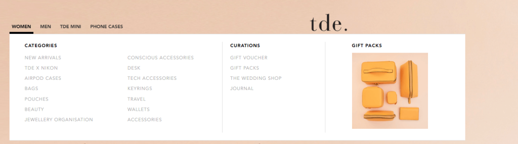
The Daily Edited categorises its menu first by its most important pages — Women, Men, TDE Mini and Phone Cases — then has a drop-down menu with product subcategories. Regardless of which page you arrive at on the website, you can easily get around thanks to its helpful menu.
Having a clear navigation menu doesn’t just improve your UX and time on site. It’s also KEY to your overall website crawlability and indexability.
On top of how users interact with your site, your navigation is also what search engine crawlers will use to index your pages to display in search engine results. Crawlers follow each link on the menu to piece together a website, much like a spider weaves threads of its web.
If you leave out crucial links in your navigation menu, search engine crawlers may miss an entire section of your website and omit it from search entirely.
2. Use faceted navigation
Faceted navigation is another feature that improves UX and SEO, particularly if you’re an eCommerce website with a large product portfolio.
Even if you don’t know what faceted navigation is, you’ve probably come across it without realising it on websites like Nike:
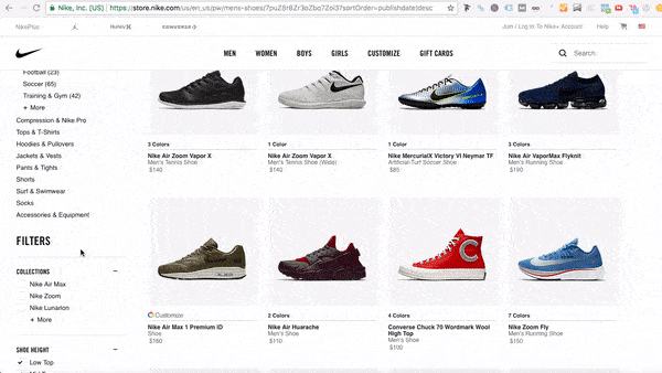
Faceted navigation makes it easier for customers to narrow down their search and find the exact products they’re looking for.
This leads to more time on site and more conversions, both of which are key ranking factors for SEO.
A word of caution, however: this type of navigation isn’t the most SEO-friendly if it’s not implemented properly.
According to Google:
“Faceted navigation, such as filtering by color or price range, can be helpful for your visitors, but it’s often not search-friendly since it creates many combinations of URLs with duplicative content. With duplicative URLs, search engines may not crawl new or updated unique content as quickly, and/or they may not index a page accurately because indexing signals are diluted between the duplicate versions.”
As such, be sure to check Google Search Central’s faceted navigation best practices to make sure you’re hitting the mark for shoppers AND searchers.
3. Use breadcrumbs
Breadcrumb navigation helps users understand where they are on your site, and navigate back to previous sections if they need to. These can either be hierarchy-based, which shows the different levels of a website like so:
Or dynamic breadcrumbs that are based on a visitor’s click path, like this one from Bed Bath and Beyond:
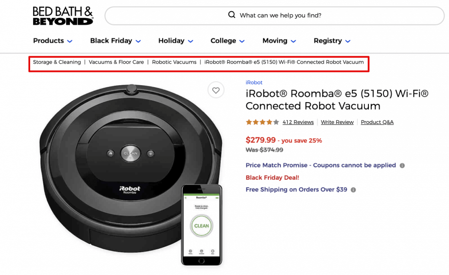
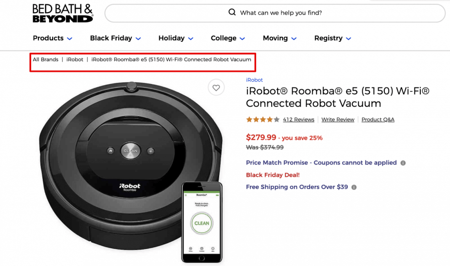
Hierarchy-based breadcrumbs are helpful because they help users reverse-engineer their search to access similar products in the same category, like ‘Cell Phones’. Meanwhile, dynamic ones can be beneficial for the overall user experience because it allows visitors to retrace their path and continue browsing more products.
Follow these steps to ensure your breadcrumbs are optimised for search and users:
- Make every step of the navigation path clickable
- Shorten longer product names or categories to keep them readable
- Collapse breadcrumbs in the middle if it’s a long breadcrumb trail
- Match the breadcrumb labels to the page names
4. Have a clear site structure
Not to be confused with navigation, your site structure (or site architecture) is how your web pages are organised on your site. This classifies your pages into categories and subcategories based on your overall products and services:
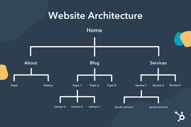
Image credit: HubSpot
In most cases, your navigation is derived from your site structure. If your overall site structure is well thought out, it’s likely your navigation menu will be as well.
A good site structure also tells Google the hierarchy of your pages, so that link juice passes smoothly from high-authority pages (like category or topic pages) to low-authority pages like blog posts or individual products.
Sitelinks can also be visible in Google search results, which means you’ll take up more real estate versus the competition:
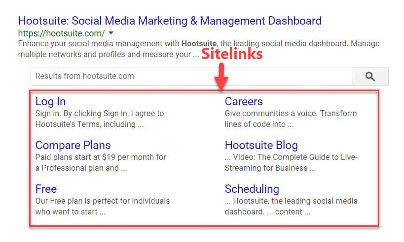
Image credit: Search Engine Journal
The key to a solid site structure is to ensure that all pages are within 3-4 clicks from the main page to make it easy for users to get around. Keep your URLs simple as well so your visitors (and Google) know exactly what the contents of each page are.
5. Make sure your website loads FAST
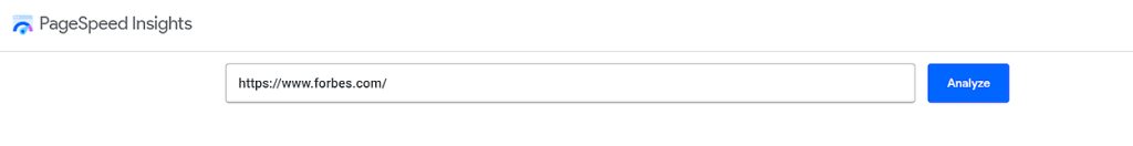
Loading times are one of those factors that can make or break your UX. 53% of all users will leave a page that takes longer than 3 seconds to load. And when people leave a website after just a few seconds, it sends a signal to Google that the website in question isn’t relevant or useful to visitors.
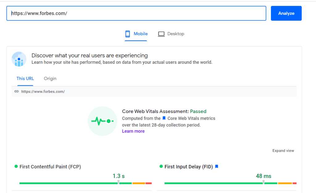
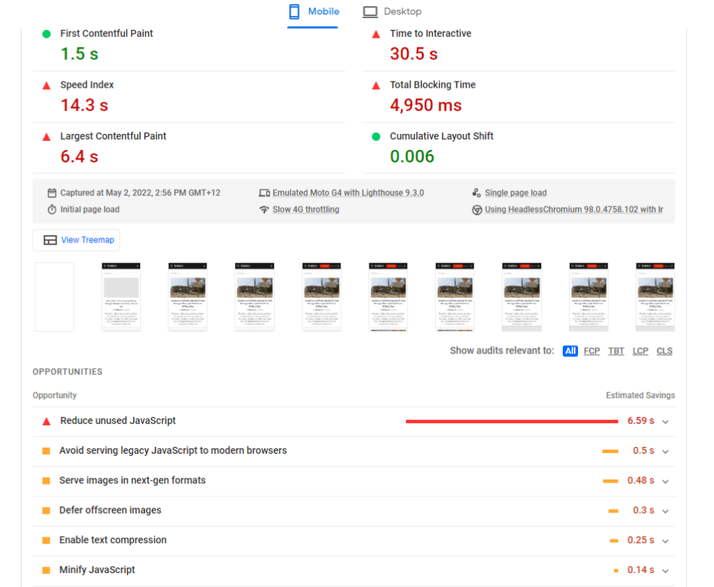
To figure out how your page load time stacks up, pop your URL into Google’s PageSpeed Insights tool:
You’ll receive information on your site speed performance for both desktop and mobile:
Google will also provide you with opportunities to shave down your load times:
Site speed and page load times have always been important, but they’re even more crucial now because of Google’s Core Web Vitals update. That brings us to the next topic:
6. Check and optimize your Core Web Vitals
If you want to deliver a good user experience and improve your rankings, you have to pay attention to your Core Web Vitals.
To start with, you can get a website of where your website currently stands using the Core Web Vitals report in Google Search Console:
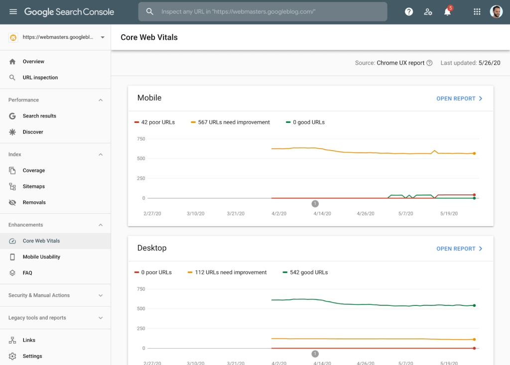
Image credit: Yoast
Click ‘open report’ for either desktop and mobile, and Google will provide you with all the information you need to address any page experience issues.
Prioritise the URLs labelled ‘poor’, then work your way up through the URLs that need improvement based on the importance of the page or the issues that are affecting the most pages.
7. Focus on mobile responsiveness and mobile optimisation
Site speed is important for any mobile-friendly website, but that’s far from the only element that needs to be considered to deliver a standout user experience.
You need to ensure every part of your website looks great and adapts to mobile, from your navigation bar to your font size and the use of responsive images.
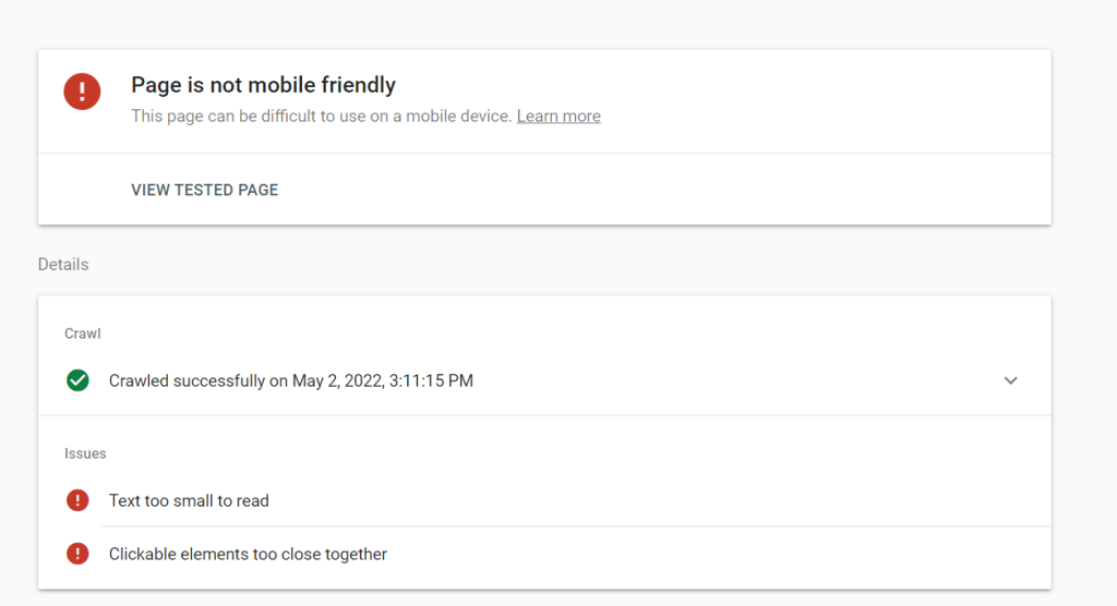
Mobile website designs can look different depending on the device, so the best way to figure out your site’s mobile-friendliness is to run it through Google’s Mobile-Friendly Test. Just pop your URL in and Google will come back with an overall score and a list of recommendations to improve the mobile experience:
8. Minimize CSS and JavaScript
CSS and JavaScript can be incredibly clunky and beef up website loading time.
For UX and SEO purposes, SEO best practices suggest keeping them to a minimum and limiting the use of any third-party scripts on your site. This is also helpful when improving your Largest Contentful Paint (LCP) component of your Core Web Vitals.
If you do need to include these scripts for sliders or contact forms, contain the code to that specific page rather than adding it to your entire website. This way you’re not slowing down the load times for users unless the feature is actually being used.
Finally, reconsider the use of sliders if possible. Sliders slow down pages dramatically and often get overlooked by visitors, much like banner ads. Depending on the type of slider, it may also not transition well to mobile devices, which puts your website’s site speed AND mobile-friendliness at risk.
9. Avoid custom fonts
Have a custom font for your website?
While these design embellishments look great, there’s a huge catch: not everyone has them installed on their browser. For the optimal user experience, stick to fonts that are already on your user’s computers, such as Google Fonts or Microsoft Fonts.
This doesn’t mean you have to get rid of your custom fonts altogether. Just reserve it for selected elements on your website, such as logos and images.
10. Optimise headers and make content easy to digest
Your website’s header is the first thing that a visitor sees when they land on your website, so this part needs to hit the mark every time.
Make sure your headers are easy to read on desktop and mobile, and limit them to roughly a quarter of the total screen real estate so users can keep scrolling down to access your content.

The same goes for when you’re creating content.
If you have engaging content, users spend more time reading what you have to say. They might browse multiple articles on your site, share your content on social media, or even subscribe to your newsletter to read more quality content in the future. All of this says one thing to Google and other search engines: that human visitors are interested in the content on your website.
The secret to delivering a fantastic user experience is to write for your visitors first as opposed to search engines. Follow these copywriting best practices to ensure your content is clear, compelling and credible, whether you’re writing long-form content or landing pages:
- Use headings and subheadings to break up your content
- Including meta titles and meta descriptions for your pages
- Adding a table of contents for longer blogs
- Include long-tail keywords from your keyword research when appropriate. However, avoid keyword stuffing as it sounds unnatural
- Incorporate media when appropriate, such as images or videos
- Write for super scanners by using bullet lists, short paragraphs, and pull-out quotes
- Create relevant content that meets a user’s search intent, whether it’s informational, transactional, or navigational
11. Consider using tabbed content
Tabbed content is a handy way of dividing the content on a page into subsections. This makes it easier for users to navigate without getting whelmed with content, and prevents you from needing to create duplicate pages on the same topic.
Here at OMG, we use tabbed content to help visitors navigate through our FAQ pages:
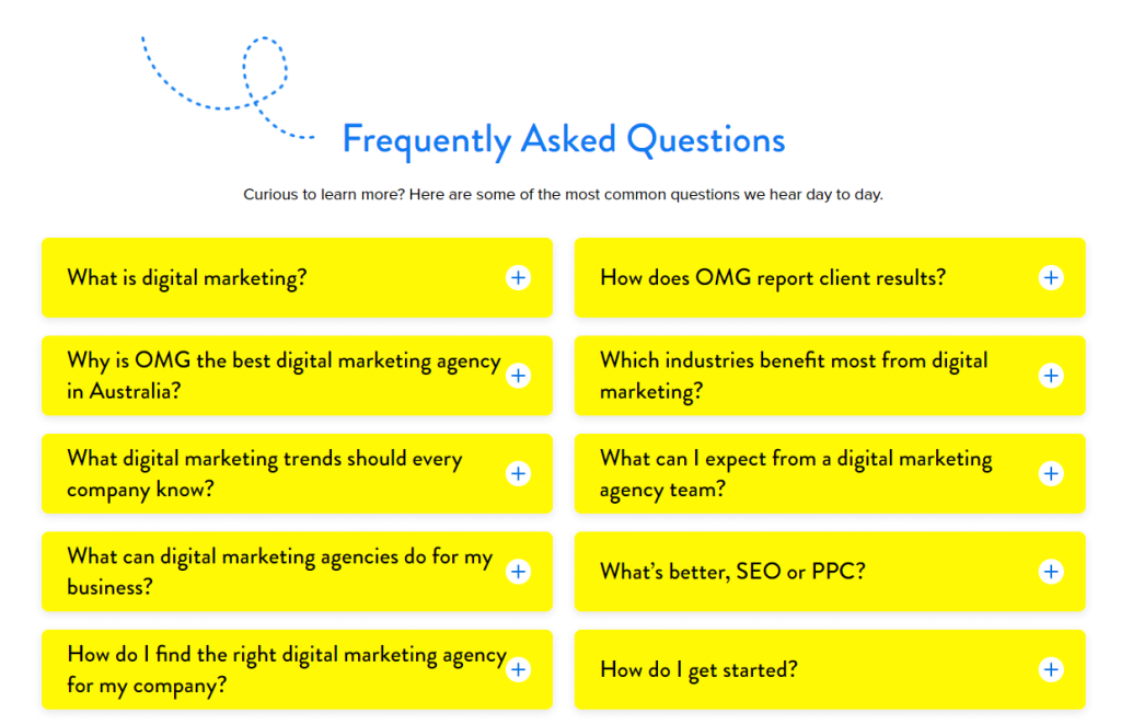
Tab labels should be short and concise and communicate exactly what that subsection is about. Remember to clearly show that each section can be expanded as well with a plus symbol, arrow, or “read more” prompt.
12. Experiment with infinite scroll
Want to keep users on your page?
Keep them scrolling.
Infinite scroll engages visitors by constantly adding new content as they reach the bottom of the page. Websites like Pinterest, Instagram and Facebook all use this feature to keep users scrolling and spending more time on their website.
Infinite scroll is best used for long product pages or for blog content, like New York Magazine’s The Cut website:

If you are considering infinite scroll, make sure to keep your load times in check and your footer accessible. eCommerce websites like ASOS use infinite scroll effectively by adding a “Load More’ button to ensure users can still access the footer content if they need to:

Dominate digital with good UX and SEO
Both SEO and UX have the same goals: to satisfy a user’s needs. When you put the two together, you have a powerhouse equation for more sales AND higher search rankings.
But this isn’t to say that the road to optimising your UX for SEO is easy. There are a lot of elements that, if not implemented correctly, run the risk of having the exact opposite effect on your website.
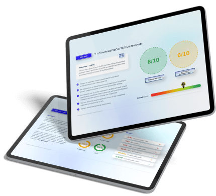
That’s why you need to bring in the big guns if you want to rank high and earn big. We’re talking about SEO agency specialists that understand exactly what it takes to build a website that users and search engines love. Learn more today by claiming your FREE expert digital marketing audit below.

About the Author
Andrew Raso
Share


