








 1300 433 071


- Home
-

- Blog
-
- How to Guide Blogs
-
- E-commerce Website Design & Development
E-commerce Website Design & Development

Key Takeaways
-
An effective e-commerce site starts with strategy, not templates. Clear business goals, defined KPIs and well-built customer personas shape every design and development decision that follows.
-
Platform choice is a long-term growth decision. Shopify suits most businesses prioritising speed, simplicity and scalability, while Adobe Commerce and WooCommerce serve more complex or custom requirements.
-
High-converting ecommerce design is about persuasion, not aesthetics. Every UI and UX decision should reduce friction and make it easier for users to find products, trust your brand and complete a purchase.
-
Feature restraint drives faster launches and better performance. Prioritising must-have functionality at launch enables quicker go-live, cleaner builds and smarter post-launch optimisation based on real user data.
-
Mobile-first is no longer optional. Designing for mobile screens first improves usability, performance and conversion rates across all devices.
-
Site speed is a commercial and SEO priority. Optimised assets, clean code, quality hosting and CDNs are critical to both user experience and search visibility.
-
Checkout optimisation directly impacts revenue. Guest checkout, fewer form fields, clear progress indicators and trusted payment options significantly reduce cart abandonment.
-
SEO must be built into the foundation, not bolted on later. Clean URLs, editable metadata, schema markup and strong technical structure ensure ecommerce sites are discoverable and scalable.
-
Launching is the start, not the finish line. Continuous testing, performance monitoring and iteration are what turn ecommerce websites into long-term growth assets.
-
Successful ecommerce websites balance design, psychology and technology. When strategy, UX, development and SEO work together, ecommerce sites become reliable revenue engines—not just digital storefronts.
Ever found yourself on a website, credit card in hand, only to be stopped dead by a clunky menu or a page that takes a year to load? You probably didn’t just wait patiently. You bounced and never went back.
Building a truly effective ecommerce website is a masterful blend of art, psychology and hardcore tech. It’s about guiding customers from “ooh, shiny” to “order confirmed” without a single moment of friction.
In this definitive ecommerce development guide, OMG will help you build a platform that doesn’t just function, but absolutely flies.
Step 1: Start with a rock-solid ecommerce plan
Jumping into an ecommerce build without a blueprint is like trying to bake a cake by chucking ingredients into a bowl and hoping for the best. It’s going to get messy, expensive and probably inedible.
Before a single line of code is written or a colour palette is chosen, you need to strategise.
Define your ‘why’: Business goals & KPIs
First things first: what do you actually want this ecommerce website to do? The answer “make sales” is a good start, but not enough. We need to get specific.
- Are you a direct-to-consumer brand focused on a high volume of transactions?
- A B2B portal where the goal is to generate qualified leads for your sales team?
- A subscription service aiming to maximise customer lifetime value?
Your primary business model will dictate the entire structure of the site. Get granular with your KPIs from day one. These numbers tell you if you’re winning or just looking busy:
- Conversion rate: The percentage of visitors who make a purchase.
- Average order value (AOV): How much customers typically spend in one go.
- Customer lifetime value (CLV): The total revenue you can expect from a single customer over time.
- Cart abandonment rate: The percentage of shoppers who add items to their cart but leave without buying.
Know thy customer, know thyself
One of the first pitfalls we see at OMG is when a client says, “we sell to everyone.”
The best ecommerce website design is laser-focused on a specific audience. It’s time to get into some method acting and build out your customer personas.
- Who are these people, really? Are they tech-savvy millennials browsing on their phones while waiting for a flat white?
- Are they time-poor procurement managers in a corporate office who value efficiency above all else?
Go deep. Think about their daily habits, technical skills, pain points and what makes them trust a brand. When you know exactly who you’re talking to, every design and copy decision becomes clearer.
Step 2: Choosing the right platform
Selecting your ecommerce platform is like picking a car. A slick two-seater sports car is thrilling, but not very practical if you need to haul timber. You need to pick the vehicle that’s right for the job. Your choice will be the single biggest technical decision you make, and it impacts everything from your day-to-day operations to your ability to scale in the future.
Fundamentally, the choice boils down to two main approaches: SaaS or Open-Source.
SaaS (Software-as-a-Service): The ‘managed’ approach
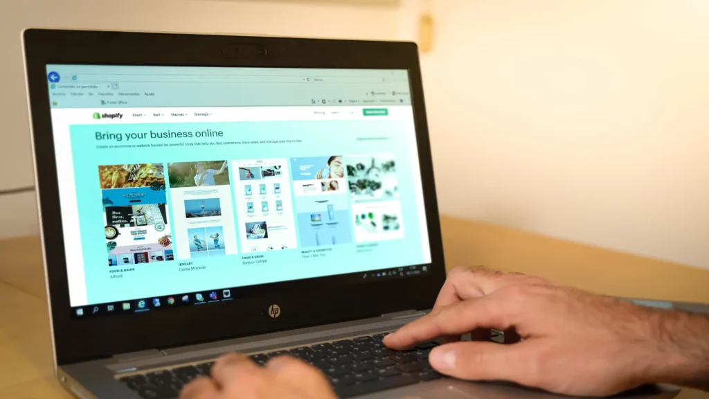
Think of SaaS platforms as leasing a high-end, fully-serviced vehicle. You pay a recurring fee, and the platform handles the engine (hosting), the security guards (compliance) and the mechanics (maintenance).
Examples: Shopify, BigCommerce.
- Pros: Incredibly easy to use, predictable monthly costs, fantastic security and reliability and faster time to market.
- Cons: You don’t own the code, so deep customisation can be limited. You’ll also likely pay transaction fees on top of your subscription.
Open-source: The ‘own-it-and-build-it’ approach
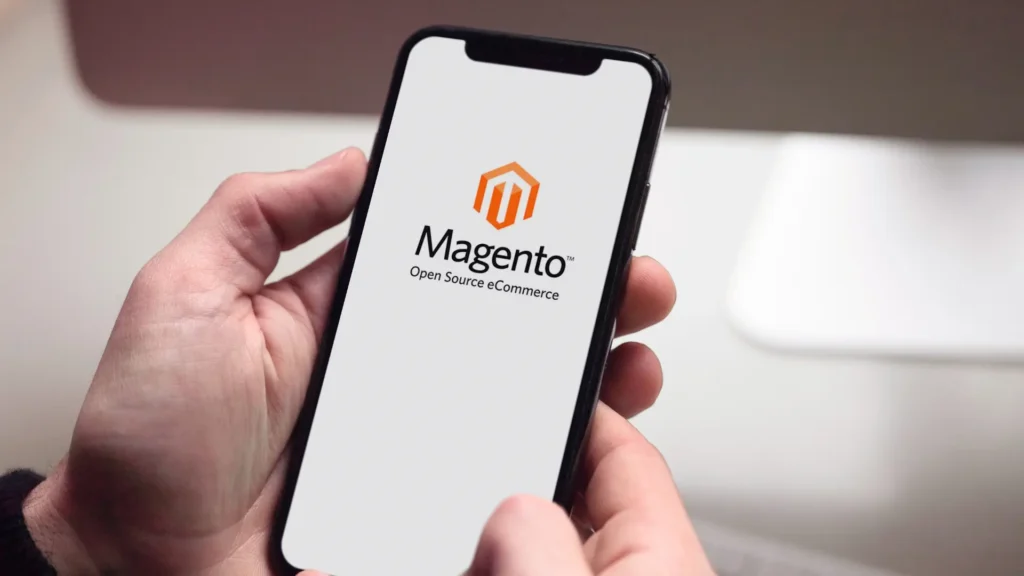
This is like buying a powerful, customisable chassis and engine, then building the rest of the car yourself. You own everything, the potential is limitless, but you’re also responsible for every single nut, bolt and oil change.
Examples: Magento (now Adobe Commerce), WooCommerce.
- Pros: Unmatched flexibility for custom features, complete ownership of your code and data and no platform-enforced transaction fees.
- Cons: Significantly higher upfront development costs, and you’re on the hook for finding and paying for hosting, security and ongoing maintenance.
The Guru’s verdict
Shopify is the undisputed king here, and we recommend it for the vast majority of startups and even rapidly scaling enterprises, especially if speed-to-market and operational simplicity are top priorities.
Adobe Commerce is a powerhouse for enterprise-level businesses with complex catalogues, global operations or unique B2B requirements. Meanwhile, WooCommerce is a brilliant, flexible choice for businesses that are already built on WordPress and want to integrate their content and ecommerce seamlessly.
A quick-fire comparison table
| Feature | Shopify | Magento (Adobe Commerce) | WooCommerce |
| Best for | Startups to large enterprises | Enterprise / complex needs | Small to large enterprises on WordPress |
| Ease of use | Very high | Low (requires developers) | Medium |
| Scalability | High | Very high | Good (with right hosting) |
| Cost | Monthly fee + app costs | High (licensing + dev) | Free (hosting/dev costs) |
Step 3: Designing an ecommerce journey people actually finish
You’ve got your plan and you’ve chosen your platform. Now we get to the part everyone thinks of when they hear ecommerce website design: making things look good.
But here’s the secret: world-class design isn’t about winning art awards. It’s a tool for persuasion. It’s about making the path to purchase so intuitive, so seamless and so damn satisfying that customers glide right through to the checkout. We created a guide to create a great customer journey.
Every design choice should be able to answer the question: “Does this make it easier for my customer to buy?” If it doesn’t, it’s just decoration.
Feature wishlist vs. the reality list
Now for the fun part. Brainstorm every single feature you’ve ever dreamed of for your site: AI-powered recommendations, a loyalty program, advanced faceted search, 3D product viewers, customer accounts, a blog, live chat… get it all down on paper.
Got your list? Great. Now, get out a red pen.
You must ruthlessly categorise this into “must-haves for launch” and “nice-to-haves for phase two.” This is critical for managing your budget and timeline. A phased approach allows you to get to market faster with a core, high-performing product, and then add bells and whistles based on real user data, not just a gut feeling.
Core principles of a high-converting UI/UX
User Interface (UI) is what it looks like. User Experience (UX) is what it feels like to use. You need to be a master of both.
- Visual hierarchy and clarity: Think of your favourite high-end, brick-and-mortar retail store. Notice how it’s not cluttered? The most important products are at eye level, the lighting guides you and the signage is crystal clear. Your ecommerce website must do the same. Use clean layouts, generous white space and professional product photos and videos to guide your user’s eye. They should instinctively know where to look and what to click without a moment’s thought.
- Frictionless navigation and search: We can’t stress this enough: if they can’t find it, they can’t buy it. Your navigation should be so logical it’s practically invisible. Organise your products into sensible categories, and use mega menus if you have a large inventory. But the real hero is your on-site search. It needs to be fast, smart and able to handle typos. When a customer searches for a “black t-shirt,” they should find exactly that, not a “blue tank top” or a “not found.”
- Compelling product pages: This is your digital showroom where browsers become buyers. A single, grainy image and a two-line description won’t cut it. Your product page is a sales pitch that needs:
- Multiple, high-res photos and videos: Show the product from every angle, in context, being used. Let them zoom in and see the texture.
- A killer description: Don’t just list specs. Tell a story. Sell the benefit, not just the feature. Read more about SEO for product descriptions.
- Social proof: Prominently display customer reviews and star ratings. We are hardwired to trust what others say more than what a brand says about itself.
- An unmissable CTA: Your “Add to Cart” or “Buy Now” button should be the most visually dominant element on the page. Use a contrasting colour and make it prominent and clickable.
Step 4: Mobile-first is the default

Take a look around. Unless your product or service is highly specialised, your customers are likely to browse your site on their phones. If an ecommerce website isn’t flawless on a mobile screen, you’re actively ignoring most of your audience.
Designing “mobile-first” means you design for the smallest screen first and then adapt the layout for larger screens like tablets and desktops. This forces you to prioritise what’s most important, resulting in a cleaner, faster experience for everyone.
Guru pro tip: Consider Progressive Web Apps (PWAs). In simple terms, a PWA is a website with all the best features of a native mobile app. It can work offline, send push notifications (perfect for abandoned cart reminders!) and offers lightning-fast, app-like performance; all without needing to be downloaded from an app store. It’s a potent tool for boosting engagement and conversions in an increasingly mobile world.
Step 5: Optimising your checkout for zero abandonment
Did you know that roughly 70% of online shopping carts are abandoned?
To be fair, not every abandoned cart represents a design failure. Many savvy shoppers today use the cart as a temporary wishlist. They might be saving items for payday or got distracted when the dog decided the couch was a chew toy. These are natural parts of the modern customer journey and are largely outside your control.
However, for those genuinely on the fence, a moment of friction is all it takes to lose them forever. This is where your design can provide that critical nudge. A seamless and ridiculously fast checkout process might be the one thing that prevents a hesitant buyer from getting spooked.
Here are a few ecommerce features to note:
- Offer guest checkout: Forcing users to create an account is a known conversion killer. Let people buy without the commitment. You can always ask them to create an account on the “thank you” page.
- Show their progress: Use a visual progress bar (e.g., Shipping > Payment > Confirm). It reduces anxiety by letting people know exactly where they are and how many steps are left.
- Minimise form fields: Only ask for the information you absolutely need to process the order. Every extra box they have to fill is another chance for them to give up.
- Display trust signals: This is mission-critical. Prominently feature security badges like SSL certificates (the padlock icon) and accepted payment logos (Visa, Mastercard, PayPal). Reassure them that their data is safe.
- Provide multiple payment options: Don’t lose a sale because you don’t offer someone’s preferred payment method. Alongside credit cards, make sure you have options like PayPal, Apple Pay, Google Pay and critically for the Australian market, Buy Now Pay Later (BNPL) services like Afterpay.
Step 6: Technical and SEO considerations for ecommerce website design
A stunning storefront and a seamless checkout are what the customer sees. But the long-term success of your ecommerce operation relies on the powerful engine humming away behind the scenes. This technical foundation ensures your site is fast, secure and visible to those who matter most: search engines and your customers.
The need for speed
In ecommerce, speed is currency. A one-second delay in page load time can slash conversions significantly. A slow site will not only frustrate users into leaving, but will also harm your SEO rankings. Performance comes from:
- Optimised elements: Huge, uncompressed photo files are the number one cause of slow-loading sites.
- Clean code: An efficient, well-structured codebase runs faster than one bogged down with messy code or excessive plugins.
- Quality hosting: Your hosting is your website’s home. Don’t cheap out. Choose a provider and plan that can handle your traffic without breaking a sweat.
- Content delivery network (CDN): This is a network of servers spread across the globe. It stores a copy of your site and delivers it from the server closest to the user, dramatically speeding up load times for international customers.
SEO-friendly from the ground up
SEO isn’t just something you “do” after launch; it should be baked into the very DNA of your ecommerce website. Building with an SEO-first mindset means creating a site that Google can easily understand and loves to rank. This includes technical features like:
- Clean URL structures: You don’t need to be an SEO wizard to know that “yourstore.com.au/womens-shoes/leather-boots” is infinitely better than “yourstore.com.au/cat?id=5&prod=123”.
- Editable metadata: The ability to easily customise page titles and meta descriptions for every product and category.
- Schema markup: This special code helps Google understand your content better, leading to “rich snippets” in search results, like star ratings, price and stock availability showing up right on the Google results page.
- Automatic XML sitemaps: A roadmap of your site that you can submit to Google to ensure it finds and indexes all your important pages.
Final advice from OMG: Going live is the start line, not the finish line
Many people think the moment a website launches is the end of the project. We at OMG see it as the start of the race. It’s when your website gets to interact with real customers that real learning can begin.
- Testing, Testing, 1, 2, 3…: Your site needs to go through hell and back. Rigorous test across different browsers, devices and screen sizes. The most important part? Inspect the entire checkout and payment process with real transactions to ensure zero hitches.
- Launch & monitor: The moment of truth! Once live, you need to be glued to your analytics. Watch the data, monitor site performance and look for unexpected user behaviour or errors.
- Maintain & scale: A great website is never truly “finished.” It’s an evolving asset. This means regular security updates, performance tweaks and using the data you’ve gathered to build a roadmap for future improvements and feature rollouts your customers want.
We can help you build an ecommerce website that dominates
As we’ve covered in this ecommerce development guide, building a high-performing store is a far cry from just picking a pretty template. It’s a strategic process that weaves together a rock-solid plan, a deep understanding of your customer, conversion-focused design and a powerful technical foundation.
When the pieces work together in harmony, the result is a productive growth engine for your business.
Want to fast track building your store? Book a free, no-obligation strategy session today and let’s talk about your next ecommerce website design.

About the Author
Andrew Raso
Share