






 1300 433 071

- Home
-

- Blog
-
- Selling Online Blogs
-
- High-Converting Landing Pages That Turn Clicks Into Customers
High-Converting Landing Pages That Turn Clicks Into Customers

Landing Page Checklist
-
Match your headline to your ad copy
-
Remove navigation and unnecessary links
-
Put your value and CTA above the fold
-
Add at least one trust element
-
Keep load times under 3 seconds
-
Use separate pages for each offer
Landing pages are one of the most important (and most misunderstood) elements of digital marketing. We regularly see brands spending heavily on ads only to send traffic to pages that simply aren’t designed to convert. As a performance-focused digital agency in Australia, Online Marketing Gurus helps businesses bridge the gap between traffic and revenue by building landing pages that prioritise clarity, intent and trust.
Dedicated landing pages outperform homepages
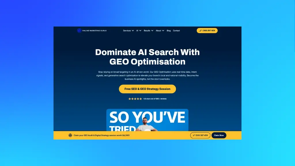
Homepages are built for exploration. Landing pages are built for action. Yet many brands still direct paid traffic to cluttered homepages filled with menus, links and competing messages. The result is predictable: confusion, hesitation and lost conversions.
Instapage highlighted how tailoring post-click landing pages to match keyword intent and paid traffic (rather than sending users to a generic page) can dramatically improve results; for example, Autopilot increased conversions by up to 254% after implementing message-matched landing pages.
What are the benefits of dedicated landing pages?
- Better user experience
- Improves quality score
- Lowers CPC
- Increases ad reach
High-performing campaigns use one page per offer, with a single goal and a single call to action. This also means to remove the navigation menu, leading to less distractions.
What are the essentials to include on a landing page?
- Headline
- Image
- Trust
- CTA
Removing navigation alone has been shown to lift conversions by double-digit percentages. In one VWO case the conversion rate doubled (100% increase) after the navigation menu was removed, and a HubSpot experiment found 16–28% uplifts when navigation links were eliminated on landing pages. When users have fewer choices, they make decisions faster.
Align your ads and landing pages to match the message
One of the fastest ways to lose conversions is mismatched messaging. If your ad promises one thing and your landing page delivers another, users bounce.
How do you mirror landing pages to the offer?
- The language used in the ad
- The offer being promoted
- The visuals and tone that match
- The intent of the campaign
This alignment reassures users they’re in the right place and that confidence directly improves conversion rates and quality score.
Campaign Monitor tested dynamically matching landing page text to users’ search terms, resulting in a 31.4% increase in conversions when the landing page copy reflected the search verb used by the visitor. By matching the landing page verb to the search query, their offer felt more relevant and enticing, leading to an impressive lift in conversions.
Above-the-Fold Clarity Is Non-Negotiable
You have seconds to communicate value. Visitors should instantly understand:
- What you offer
- Who it’s for
- Why it matters
- What to do next
Going(dot)com doubled sign-ups after changing just three words (switching their CTA from “Sign up for free” to “Trial for free”) demonstrating the impact of small copy changes on conversion behaviour. Same offer, but clearer framing made all the difference.
How do you communicate value immediately?
- Headline should communicate the direct or primary benefit
- Subheading should explains and clarify it
- Visible Call-To-Action (CTA) without scrolling
Landing pages that delay this clarity lose momentum fast.
Trust elements that remove hesitation
Even when users are interested, doubt can stop them from converting. That’s why trust signals matter most near the point of action.
Effective trust elements include:
- Review scores
- Client logos
- Ratings
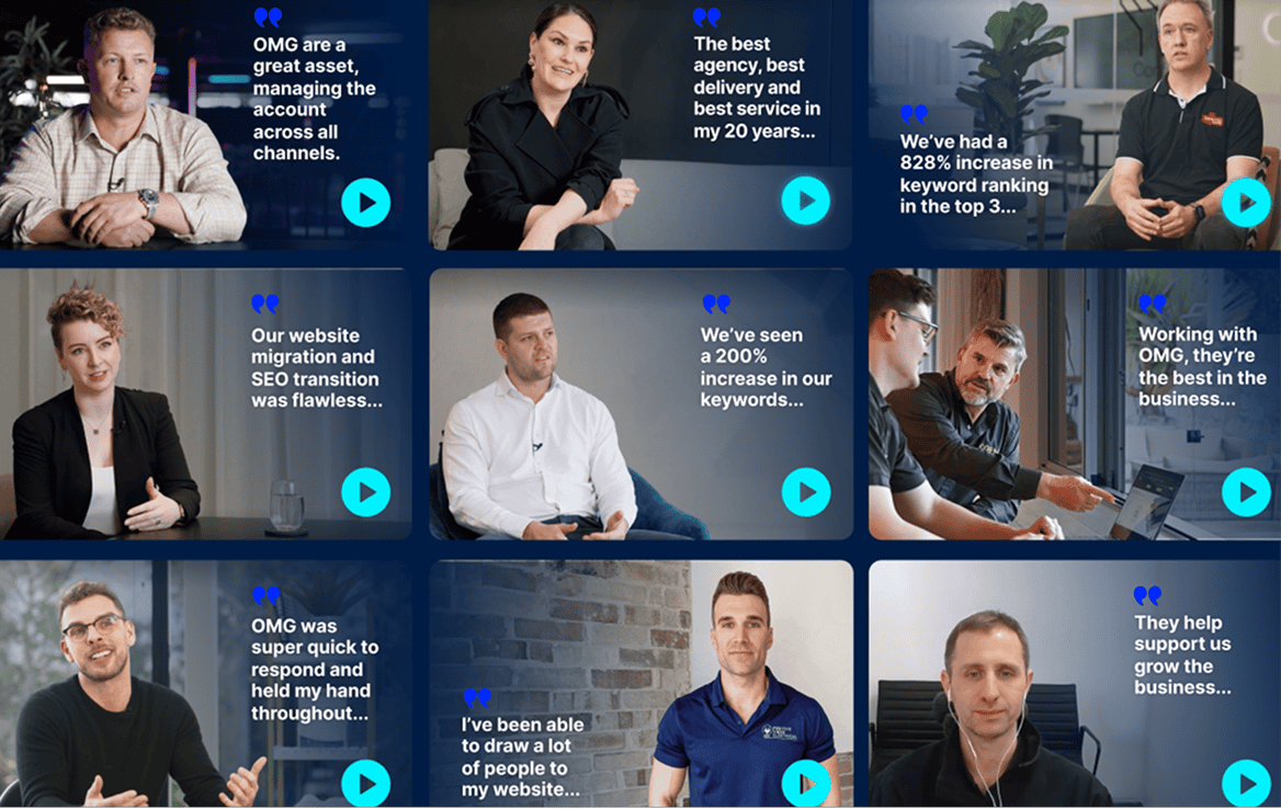
- Testimonials with real names and photos
- Guarantees or risk-reversal statements
How to improve trust in landing pages?
High-converting landing pages use the following to reduce friction:
- Testimonials
- Trust badges
- Guarantees
- Quotes
- Ratings
- Client logos
Put yourself in the users’ shoes and imagine where doubt often creeps in: near the CTA or form. Include how many customers or clients you have, or are using your product and can recommend your brand. Add a line like “Trusted by 5,000+”. These cues reduce perceived risk at the exact moment users are deciding whether to act.
Micro-Copy: Small Words, Big Impact
Landing page performance often hinges on details. Referring to the Going(dot)com example mentioned above, a single CTA change can double conversions. That’s the power of micro-copy: wording can shift intent.
Effective landing pages test small changes:
- CTA language
- Headline phrasing
- Button text
- Form labels
The highest-converting pages are rarely clever. They’re clear, focused and continuously refined.
Paid Media Performance Needs Constant Refining
High-converting landing pages are critical to PPC success. Better UX improves engagement metrics, which feeds directly into quality score and cost efficiency.
If you’re paying for traffic but not seeing returns, your landing pages are the first place to look. At Online Marketing Gurus, we design, test and optimise landing pages that turn ad spend into measurable growth. If you want help improving conversion rates across paid and organic channels, our team is ready to help.

About the Author
Andrew Raso
Share