34 High Converting Landing Page Examples with Best Practices for 2022 


You’ve got traffic coming to your website. You have a solid offer that’s more enticing than any others on the market. Now, it’s time to convert your visitors into leads and sales — and to do that, you need a killer landing page.
Your landing page is a make-or-break part of the user journey.
It’s where you educate your visitors on your products, and how it meets their needs. It’s where you promote your offer and show why it’s better than the competition. And most importantly, it’s where you convince your visitors to go from being just that — visitors — to being a paying customer.
Get your landing pages right, and watch the revenue pour in. Miss the mark, and your customers might turn around and head straight for the competition.
But what separates a high-converting landing page from the rest? And how can you prime your landing pages for conversions?
That’s what we’re going to reveal in this post.
This guide will help you understand:
- What is a landing page and the importance of having them
- The elements of a landing page
- Landing page copywriting tips and tricks
- 34 Examples of great landing pages
- Key metrics in evaluating your landing page success
- Why these metrics are worth monitoring
Ready? Let’s jump in.
What is a landing page and what’s the importance of having them?
A landing page is a page that visitors arrive at on your website from another location, email newsletter, or a Google search.
Landing pages aren’t homepages. Home pages feature generic information about your brand and product, are designed to invite visitors to explore your website, and may have multiple calls to action. Landing pages, on the other hand, are far more specific and goal-oriented. They frame your content offer in a directed and targeted way based on where the user came from and what they’re interested in.
These types of pages serve five important purposes:
- They help generate leads for your business
- They allow you to understand your prospect’s demographics
- They enable you to better match your copy with prospect’s search queries
- They power results-driven decision-making with data
- And they fuel all of your other marketing efforts
Important reason #1: Lead Generation
An important aspect of landing pages is to help you define and distinguish the difference between a visitor and a lead. Qualify these visitors, ensure they actually want to learn more about your offer, and your company and leave them wanting to know more.
A landing page allows you to start moving potential customers down the marketing funnel. If you have a great content offer, one that answers a query or solves a problem, your signups will increase resulting in a soar in potential leads.
A study from HubSpot revealed that the more landing pages you have, the higher your conversion rate highlighting that having between 10-12 landing pages can result in a 55% increase in leads. As such, the more landing pages you have, the more conversion opportunities you are providing for your visitors, as shown in the graph below.
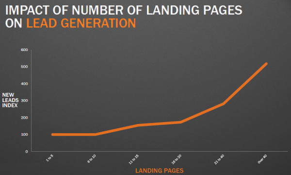
Source: PWD
Important reason #2: Understanding your prospect’s demographic
This is simply done through the forms we ask our prospects to fill out. Instead of having audiences pay for an offer, an exchange of information for the content offer helps businesses gather intel in which they can effectively use to better target their target audiences’ needs, desires and key problems.
Landing pages can help us determine the nature of these leads, as they are great catalysts for qualifying leads before the sales team gets to them. These landing pages can dictate whether the intel gathered from the form allows the lead to go to the sales team altogether.
Consider what information is necessary for your business and your content offer. Omnisend discovered that different form fields have differing average sign up rates, with forms only containing email addresses and phone numbers performing the best at 10.15%. Something to keep in mind when drafting your form fields.
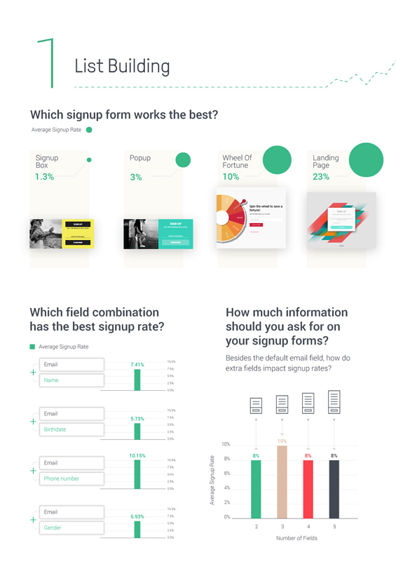
Source: Modern Marketing Partners
On top of this, landing pages allow you to identify which prospects are more engaged so you can reach out or target them in future communications.
Let’s say you have 10,000 prospects in your database. It’s impossible to reach out to every single one individually. However, if you funnel these prospects to a landing page, you can pinpoint the ones who click through to your page or download your lead magnet. These prospects are likely to be more interested in your products or services and as a result, more likely to convert. If you focus future marketing efforts on these warm leads, you’ll skyrocket conversion rates before you know it.
Important reason #3: Message Match
So a potential lead has clicked on one of your ads, landing them onto one of your pages. The key here is to have similar messaging from the ad copy to your landing page so it reinforces the prospect’s primary goal to answer their problem with your content offer.
This is similar to watching a trailer for an upcoming movie but upon watching it, the trailer looked a lot better than the final product. Having consistent messaging between ad copy and landing pages ensures prospects they’ve made the right decision to click on your ad.
Wishpond found that having more than one offer on a landing page reduces a landing page’s conversion rate by a whopping 266%. This ultimately shows that it’s vital to have content that matches what the visitor clicked on to best satisfy their pain points.
Important reason #4: Results-driven decision making through data tracking
Understanding how many times a prospect has downloaded your content offer, viewed a page, or submitted a form, can show how engaged they are with your brand. These are the types of prospects that are inclined to take you up on your offer anytime soon.
That’s just one side of the coin. The other side is tracking and analysing the performance of your landing pages. Depending on your industry, you can determine metric success differently.
Since prospects in different industries have different wants, having your own metrics and benchmarks can help your business assess which landing pages are performing the best and which ones require an update.
Important reason #5: Fuel your other digital marketing efforts
A landing page isn’t just useful as a conversion tool — it’s a great addition to your overall inbound marketing strategy. A landing page can be shared via social media, promoted via email newsletters, used in your paid ad campaigns, or incorporated into your broader lead nurturing strategy. If you optimise them well, they also give you more opportunities to appear in Google’s organic search results.
Bottom line is: get your landing pages right, and you’ll level up all of your other marketing channels at the same time.
If you’re looking for a complete inbound marketing checklist for 2022, be sure to visit our blog to help you grow faster and more effectively.
The 7 crucial elements to creating the best landing pages
Before deep-diving into the realm of landing pages, be aware of what’s necessary to help you generate conversions.
Consistency throughout your page is crucial to creating a successful landing page with that, let’s break down the main skeleton of a landing page:
1. Headings
It goes without saying the first thing you need for your landing page is a heading. It doesn’t have to be catchy, quirky or smart, but needs to reiterate what the prospective visitor clicked on for them to arrive here. Clear and concise headings inform the reader exactly what they’re in for when reading further.
A good business practice to implement here is to incorporate your unique value proposition in the headline. This is a creative way to entice visitors to read further along your entire page as they are informed instantaneously of what your content offer can do for them. Tailoring the heading to a specific buyer persona can show that you understand your target audience’s pain points and aim to resolve them with your content offer.
2. Compelling and Supportive Copy
Ad copy refers to the text or body of your landing page, explaining the content offer and how valuable it is for the visitor in a clear, simple and captivating way.
Here, consistent messaging is key to keep the prospect reading with the intention of converting them into leads. Good landing pages match copy with message intent to help persuade prospects that this is the offer for them. Failure to do this can result in high bounce rates.
Now, it’s one thing to write content. It’s another to make it captivating for your audience. Here are some golden rules to abide by to make your copy worth the read:
Cover the main points:
-
Addressing the problem: Highlight the unique pain points of the specific persona you’re targeting
To get a visitor to resonate with your product offering, consider how you will satisfy their needs. Understanding your ideal buyer persona is vital in helping you target your copy accordingly to generate more conversions.
Some common pain points can include cost or time restrictions and/or lack of access to the solution, understanding this is crucial to persona targeting and overall, addressing the problem.
-
Agitate the problem: Highlight how their problem won’t get resolved if no action gets taken
Simply put, stir that emotional pot. Using emotive language is a powerful driver to agitate a visitor’s main pain point. Get prospects to visualise what will happen if they don’t take any action to resolve their issue.
Keep in mind that, if a visitor has landed on your page, they’re more than likely conscious of their problem and want to resolve it asap. Poke the bear here to stimulate conversion.
-
Solution to the problem: Identify unique selling points of your solution
Oftentimes your competitors have similar product/service offerings to you and your business, but what makes you unique? Why should a customer pick you over your competitors? For example, a phone can have better camera quality but what’s the benefit? That you can take better photos or capture videos in higher resolutions.
Identifying your unique selling points shows visitors how you differentiate from the rest and can help reinforce why prospective visitors should choose you. Especially in highly saturated markets/industries, you need to stand out to survive.
Preemptively respond to objections: Put yourself in your visitors’ shoes and consider why they might challenge you and your content offer. Including this in your copy in your own landing pages is key to building a relationship and trust with your audience – thereby making them more likely to convert into leads.
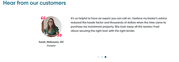
Build trust with your prospect: Voice yourself as if you were talking to your audience in person. Citing statistics or using social proof to highlight similar customer stories can help create captivating content and encourage conversion.
3. Product/Service Imagery or Videography
A picture can say a thousand words right? A hero image or video is a visual that dominates your landing page, so make sure those one thousand words are captivating and consistent with your heading and copy.
This is usually the first thing your audience sees, so a good practice is to showcase your offer in your hero visual. By showcasing your offer via landing page images, you can visually:
- Display your offer: e.g. a product launch
- Showcase how your offer works: e.g. the use of software on a device
- Highlight a benefit(s) from someone using your offer: e.g. a service offering
Hero image dimensions must be considered also as searches aren’t just done through a computer. Having your hero visual flexible to desktop, mobile and tablet ensures a good user experience. Consider the following for your landing page:
Full-screen and Banner Image Dimensions
A full-screen hero image is 1,200 pixels wide with a 16:9 aspect ratio.
A banner hero image’s ideal size is 1600 x 500 pixels.
Depending on screen size, you could extend the size to 1,800 pixels but keep in mind that the bigger the image, the bigger the file size which can slow down your site speed.
Mobile Landing Page Dimensions
The ideal size for a mobile hero image is 800 x 1,200 pixels. The design of a mobile hero image must be responsive and fit for mobile (vertical orientation) and tablet (horizontal orientation). Consider what visuals work better for different devices.
Videos perform better on desktops but as they take more time to load, they may not be mobile appropriate. Therefore it’s ideal to swap to static images on mobile and/or tablets for the sake of site speed and overall user experience.
Hero Image Compression
Compressing your hero image is vital for optimal site speed performance. Sites like JPEG Optimizer, TinyPNG, or Optimizilla can compress images without compromising quality (anything over 1MB is too big and will slow down your site speed).
Having a killer hero image or video can help prospects envision themselves using your offer to solve their pain point which can stimulate feelings of trust. Not only is it attention-grabbing, but when used correctly, can promote positive feelings about your offer and your brand.
Tip: refrain from using generic stock photos on your landing page, as these images lack authenticity.
4. Social Proof
Social proof is the online equivalent of word-of-mouth. Including social proof can significantly help to strengthen your relationship and trust with your landing page visitors. This can be done through client testimonials.
A testimonial is an honest review or recommendation from a client about your product or service. These can often showcase the benefits of your offering through the eyes of a customer, allowing visitors to resonate with like-minded people and additionally, trust your brand more.
Testimonials don’t just have to be quotes – you can get creative here! Other great examples can include:
- Customer success stories: through video/audio or even through social media, showcasing live how you have helped solve a customer’s pain point. You can experiment with your creative juices to find ways to attract your ideal customers.
- Case studies: more formal here but this involves a more intense, much closer look at exactly how clients have benefited from your offering. Normally presented as a blog article but can be a feature video also.
- Direct quotes from customers: simple, effective and much more time-efficient for prospects who might not have all the time in the world to browse your website. This is ideal for companies targeting buyer personas with busy schedules.
- Company logos: this is more relevant for B2B or SaaS offers but displaying the companies you’ve partnered with or helped, can show how popular your offering is, enhancing the reliability and trustworthiness of your business and your offer in solving key pain points.
- Industry Awards: similar to company logos, highlighting the accolades your company has been awarded can show that your offer works and you’re a leader in your industry, which can further promote your reliability and credibility amongst your competitors.
Tip: don’t fake your social proof. Getting caught out on a lie is unethical, illegal, not to mention can severely hurt your relationship with your target audience and can stain future prospects from converting.
5. The form and form fields
Remember, the primary goal of your landing page is to convert prospects into leads. Having a form that is clear, concise and to the point, will allow these prospects to effortlessly complete it, without any hassle. How can your business get the valuable information you need to target your prospects better?
What’s on the form is completely up to you and how you choose to gather information, however, here are some general tips to consider:
- Ask for enough information, but not too much
- More information can be helpful for qualifying out low-quality leads if that is your intention
- Less information can help increase volume because you’re asking for less information in that interaction
It’s crucial for any business to collect the most relevant information necessary in order to convert these prospects into leads. By adding other specific criteria, you can screen leads appropriately and nurture them with the offers that suit them best based on their personal information.
6. The Call-To-Action (CTA)
Your call-to-action should advise visitors what will happen once they click on that button. Your calls-to-action should reflect your page’s goal. The aim here is to encourage these visitors to convert so a clear CTA is crucial.
Just like the other elements on your landing page, this should also be captivating yet action-oriented. Here are some general tips you should consider when creating your calls-to-action:
- Use action-derived verbs or benefit-oriented phrases
- Don’t make it too long, 1-5 words max
- The CTA should stand out! Experiment with contrasting colours and/or fonts to grab attention
- If relevant, highlight your unique selling proposition (USP) in the call-to-action
Depending on the industry, it’s worth it to say what visitors will get when they click on your CTA, so:
Instead of: “Call us today!”
You could say: “Call 1300 TURF NOW for 10% off”
Making your call-to-action crystal clear helps remove any doubt in the mind of your prospects, encouraging conversion. It’s absolutely essential for custom landing pages to have CTA’s as this is how we can track conversion rates and measure how successful our landing pages are.
7. Social sharing links or buttons
What’s better than promoting your landing page to potential customers?
Having those potential customers spread the word to their friends for you.
Social sharing buttons enable visitors to easily share a landing page with their connections on social networks like Facebook, LinkedIn or Twitter. These handy links are a great way to maximise the reach of your message. Plus, they’re invaluable when it comes to building up trust with your target audience, given that 92% of consumers trust the opinions of friends and family.
Here’s one good landing page example from Hubspot to promote their free online courses:
Landing page copywriting tips and tricks
Effective SEO copywriting plays a huge role in high-converting landing pages. The right combination of words can sway your audience to take action, whether it’s filling out a form to download an eBook or signing up for pre-sales for an upcoming product launch.
When you’re building your landing page, keep these X best practices in mind and you’ll convert more visitors into leads and sales before you know it.
Tip #1: Spell out your value proposition in the headline
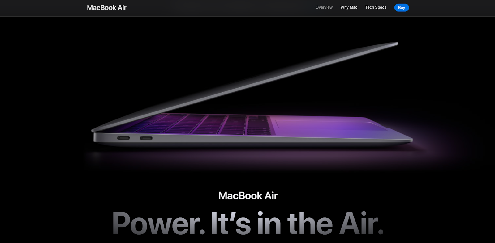
If your landing page doesn’t clearly state what you do and why it benefits your audience, don’t expect them to stick around and find out. Good landing pages don’t play guessing games with visitors. They make their value proposition clear to anyone who lands on the page, as well as what visitors need to do next.
Keep your landing page copy clear, concise, and free of any jargon. Use language that your visitors can digest as soon as they land on the page, just like Apple has done with this landing page for the Macbook Air:
Tip #2: Align your features and benefits with your audience
Features and benefits are two key pieces of information that help your website visitors understand:
- What your product or service is.
- How it solves a problem that they have.
You should have both on your landing page; however, the amount of detail you go into for your features and benefits depends on your audience’s knowledge level and their expectations.
For low-knowledge users who have little understanding of the nitty-gritty details, you want to focus on the benefits — in other words, how your product or service will help them.
Let’s say you’re promoting a cloud hosting platform to someone who has never used a service like this before. If you list out detailed features, such as the level of encryption that your platform has, you run the risk of overwhelming them with information. In this case, it’s better to focus on the benefits — the fact that their information is secure — rather than the features.
The same goes for products that have similar features, like furniture.
On the other hand, if you have a highly knowledgeable audience, like a group of hobbyists or industry professionals, it often helps to lean more into the technical specs on your landing page. These experienced users likely already understand the benefits of the product or service you’re offering. What they’re looking for is a faster, better version of what they’re already using — and features are the best way to ensure your product stands out from the competition.
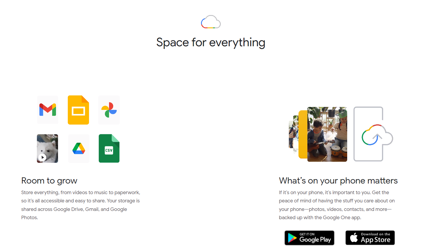
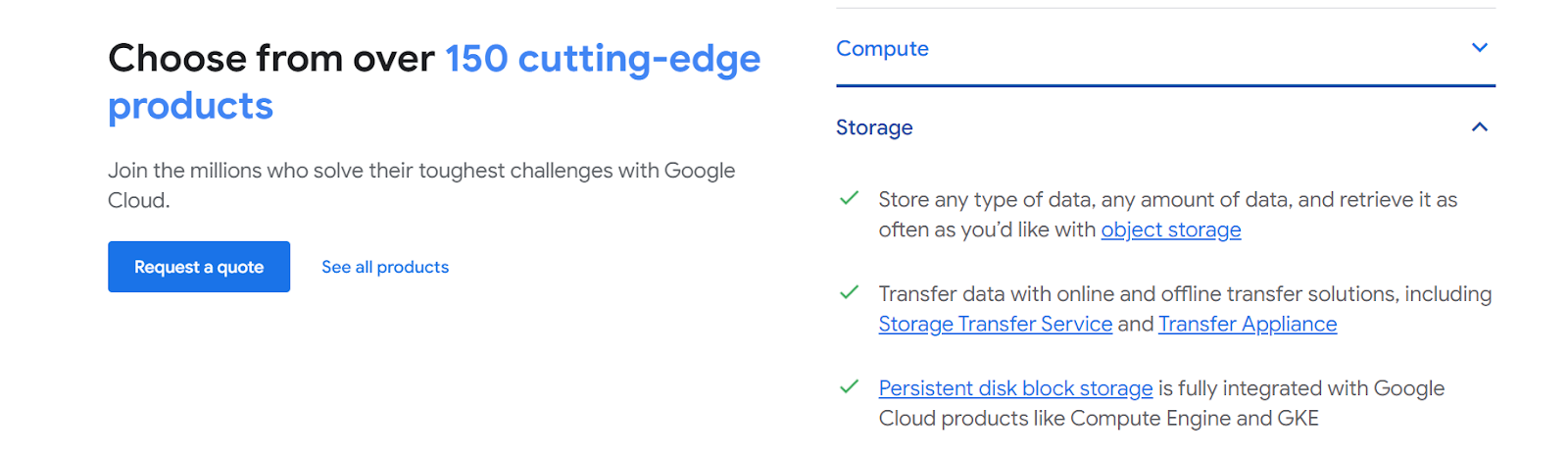
Just look at how Google promotes Google One, their basic cloud service, compared to Google Cloud for enterprises.
The landing page for Google One focuses on the benefits of using the service, such as having space for everything and room to grow.
With Google Cloud Storage, the copy focuses much more on technical details, such as persistent disk block storage and data retrieval.
Tip #3: Use power words
Power words are words that grab your attention and trigger an emotional response. When used well in your landing page copy, these words evoke powerful feelings in your visitors, such as empowerment, happiness, curiosity, or the dreaded FOMO (fear of missing out). More importantly, they can transform your landing page into a conversion machine that inspires users to take action.
There are more than 800+ power words that you can sprinkle into your copy, from encouraging power words like “extraordinary” to safety power words like “best-selling”. Just be mindful to not go overboard, otherwise these power words will lose their impact on the page.
Tip #4: Follow the PAS formula
Not sure where to start with crafting great landing page copy? Use the PAS formula.
The PAS formula involves three steps:
- Accurately identify the Problem
- Agitate the problem
- Solve the problem with your product or service
This bulletproof formula plays upon one of the biggest drivers for action in any audience: solving their pain points.
Start by clearly stating the underlying problem that your product addresses, then agitate that by painting a clear picture of the hassles and challenges that this problem brings into your audience’s life.
By this point, your audience should be in complete agreement with you that they want to make this problem go away — and you can introduce the product or service that will solve their pain point.
Tip #5: Don’t hide crucial information
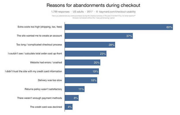
Have a service with a monthly subscription fee? Need to add shipping on top of every order? While it might seem tempting to hide this information on your landing page, you’re doing yourself a disservice — and losing out on valuable conversions.
Here’s the thing. People don’t like to be surprised with additional costs or terms and conditions after the fact. In fact, extra costs are the number one reason that customers abandon their shopping cart during the checkout phase for eCommerce stores:
Be upfront with your customers on your landing page. Include critical information that they need to know, such as:
- Product pricing
- Any add-ons, fees, and other extra charges
- Shipping fees
- Personal data storage and use policy
- Product usage terms and conditions
- Any affiliated products, companies and links
By doing this, your audience knows exactly what they’re getting into when they fill out a form or add an item to their cart. On top of being ethical, this best practice will also help improve your conversion rates as customers won’t be struck with any surprises when they go to seal the deal.
Landing page best practices to help you convert in 2022
Got a compelling offer?
That’s a great start. But that’s only part of the equation.
Even the best offers fall short if your landing page isn’t up to par. You need to have an eye-catching design, fast loading times, effective messaging, and persuasive content on your landing page if you want to persuade visitors to take action.
Use these 8 landing page best practices to turn up the dial on leads, conversions and sales:
- Understanding your buyer persona
- Message must match the ad
- Keep the action above the fold
- Compelling copy is a must
- Simple is better, especially with form fields
- Get rid of on-page distractions
- A quick page speed
- Don’t fake social proof
Landing page best practice #1: Understand your target buyer persona and speak to that audience
Before you create your offer or even your landing page, you need to know who you’re speaking to.
See, all of the best practices in the world won’t help you IF you don’t fundamentally understand what your audience wants and how your product or service solves their problems.
Buyer personas aren’t just about listing out demographics and locations. They’re about digging deep to empathise with potential customers and what their deepest pain points and challenges are.
Hubspot’s Make My Persona Generator is a great starting point to build out a comprehensive buyer persona that ticks all the boxes:
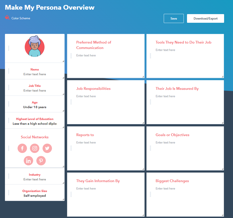
Once you’ve fleshed out these personas, you’ll have all the information you need to build a landing page that’s hyper-targeted to your core audience, from the imagery to the messaging and design.
This exercise is also handy when you’re nurturing these leads in the future. By understanding your audience’s goals and challenges, it’s easier to craft an offer that appeals to them, such as an eBook addressing their pain points or a discount to mitigate any barriers to entry.
Landing page best practice #2: Ensure the message matches the ad
Everyone has an expectation when they arrive on your landing page.
It doesn’t matter if they discovered your page via Google Ads or a social media post. They clicked on the ad because they’re interested in what you had to offer — and if your landing page doesn’t align with that expectation, they’ll be bouncing from your website before you know it.
Imagine this: you click on a Google ad that promotes a free 14-day trial for a website hosting company. Once you land on the page, that offer is nowhere to be found.
Would you stick around to try and look for it?
Probably not.
More likely, you’ll click back on your browser and look for another company that DOES offer what you’re looking for.
Consider the customer journey: where are your visitors arriving from, and what do they expect to see when they get there? Make sure that you align your landing page with their expectation to maximise your chances of conversion.
Landing page best practice #3: Keep action above the fold
“Above the fold” refers to any content that users don’t have to scroll to see.
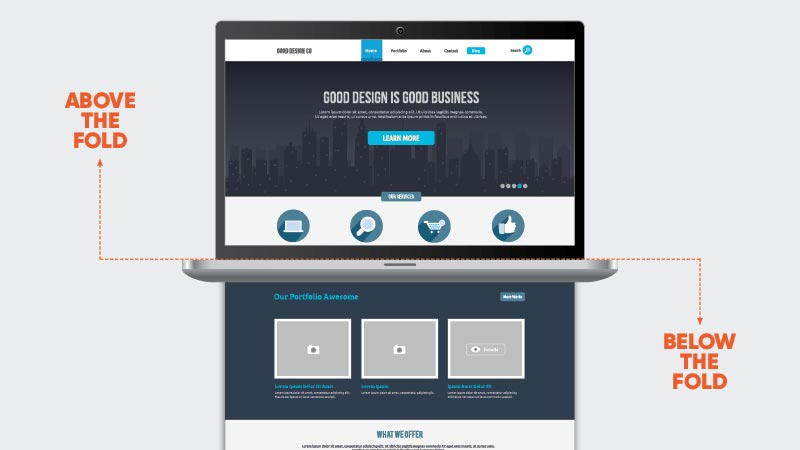
Image source: Pace Communications
This section of your landing page is the most important because it’s what the bulk of your audience will see.
According to Nielson Norman Group, content above the fold receives the highest share of viewing time, with 57% of users spending their time on the first screen of a page.
This means that if you hide your offer or USPs below the fold, 43% of your website visitors will NEVER see it.
If you want people to take action, you need to present the most important information upfront. Ensure that your headline, USPs and CTA are designed above the fold, so users know exactly what’s on offer as soon as they arrive on the page.
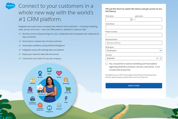
Here’s a great example from Salesforce:
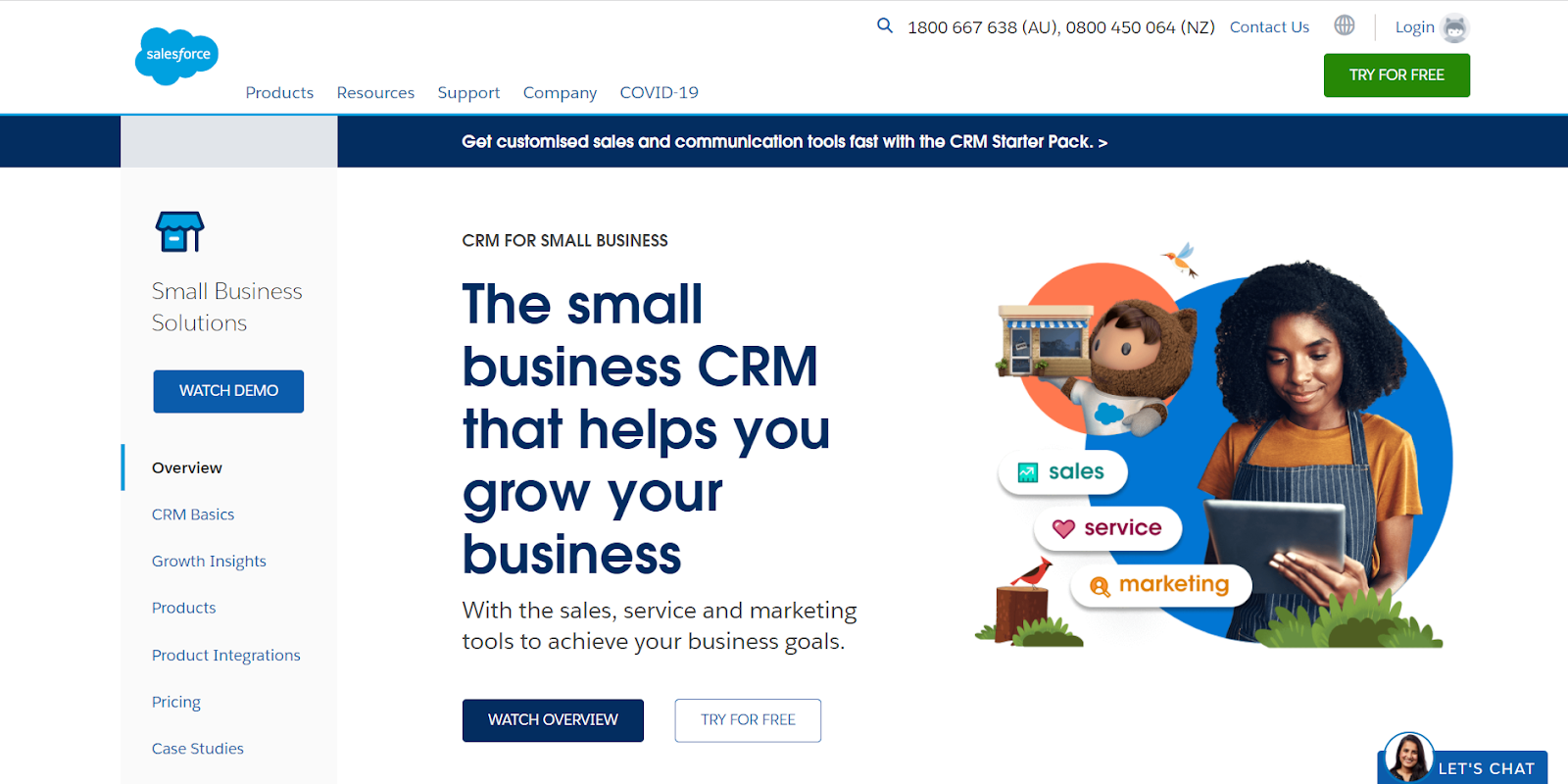
As soon as visitors arrive on the landing page, they’re presented with a bold headline that outlines the benefits of using Salesforce’s CRM and a clear CTA to try it for free.
Landing page best practice #4: Write compelling copy
Even if you have the best imagery in the world, you won’t get very far if your copy falls flat.
Your copy is what persuades your visitors to sign up, fill out a form, or make a purchase with your company. Make sure you communicate your offer in an impactful way with clear, concise sentences and use words such as “you” or “your” to make them feel engaged. Don’t forget about other copywriting best practices too, like using power words or writing a killer headline.
Another tip: always test your copy. Play around with different headlines, benefits and CTAs, switch them up, then repeat the process over and over. Doing so will reveal what resonates with your target audience based on evidence, not opinion.
Landing page best practice #5: Make your form fields simple, not intimidating
Did you know that removing just one form field can boost conversion rates by as much as 50%?
Here’s why.
People don’t like filling out lengthy forms to access information. Think about it: if you’re presented with this form to simply download an eBook, would you go ahead?
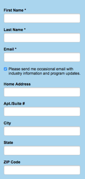
Probably not. In fact, your first thought’s likely to be “why do they need my street address for an eBook download?”
There’s a time and a place for long forms, but your landing page usually isn’t one of them. As a general rule of thumb, keep the content on a need-to-know basis: gather as much information as you need to nurture a lead, and gather the rest of your information through future campaigns.
Landing page design tip: Customise each field to link your prospects’ keyboard to make the process even easier. For example, have your form input field automatically switch them to the numerical keyword when they click the mobile number field.
Landing page best practice #6: Remove navigation and other distractions
Your landing page should be laser-focused on one goal: to get your audience to convert. To that end, you want to get rid of any distractions on the page that may divert your visitor’s focus from the key message.
Remove any website navigation or links on your landing page. Keep your design clean and simple, like this one from Wix:
Landing page best practice #7: Improve page load speed
Got a high bounce rate on your landing page? Your load speed might be the culprit.
On average, website conversion rates drop 4.42% with each additional second of load time between 0-5 seconds. This figure is even worse on mobile: for every second of delay, conversions can fall by as much as 20%.
That means that you’re losing 1 in 5 leads on your landing page simply because your website isn’t fast enough.
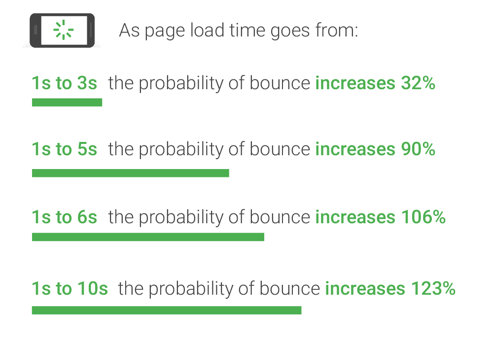
Image Source: Think with Google
Having a fast-loading page is also crucial for your SEO efforts. In 2021, Google introduced new Core Web Vitals as one of the ranking signals in organic search engine results pages. In particular, Core Web Vitals focus on three performance metrics related to page speed and user interaction:
- Largest Contentful Paint (LCP), which measures the amount of time it takes for a page’s primary content to load.
- First Input Delay (FID), which measures the time it takes for a web page to become ready for users to interact with the content.
- Cumulative Layout Shift (CLS), which measures the visual stability of a page.
According to Neil Patel, 47% of users expect a website to load in 2 seconds or less.
So how do you cut down the load time of your web page? Follow these steps to get started:
- Compress the size of the images on your website.
- Remove any unnecessary plugins on the website.
- Minify your CSS, Javascript, and HTML codes.
- Use a performance-optimized hosting solution.
Landing page best practice #8: Don’t fake social proof
Testimonials and reviews often provide customers with that final nudge they need to sign up for your service or try your product. But one of the worst things you can do is add a fake piece of social proof in the hopes it’ll get your customer over the line.
Only use real testimonials and reviews that have been provided to you (with permission, of course). You could do this by adding some reviews along with a link to where you obtained your reviews so customers can hop on and scope it out for themselves:
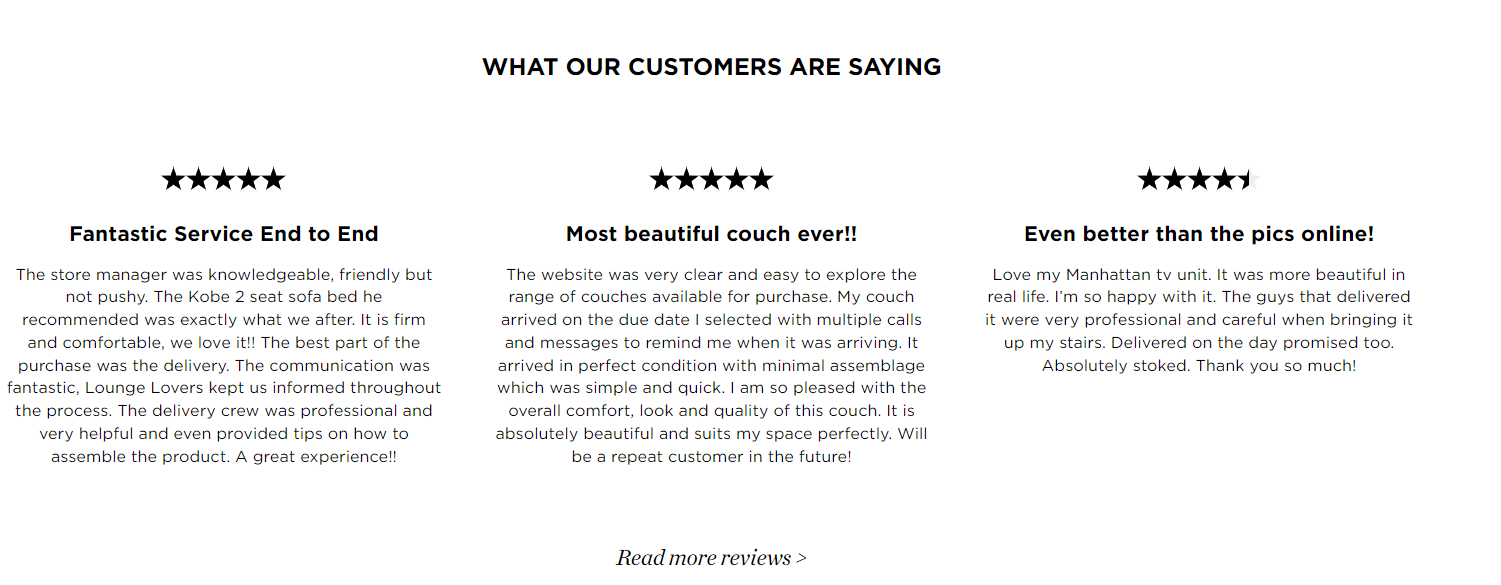
Image source: Lounge Lovers
Another option is to embed your Google My Business, Product Review or TripAdvisor reviews directly into your page, so customers are always getting the most recent reviews:
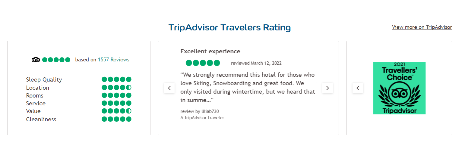
Image source: Club Med
34 High-converting landing page examples
We’ve covered off the top landing page best practices. Now, it’s time to see these put into action.
Here are 34 standout landing page examples that are brilliant at capturing their website visitors’ attention whilst focusing on conversion. We divided these into B2B, B2C SaaS, eCommerce, Not for profit, Finance and Healthcare landing pages:
Best landing page examples – B2B
Shopify
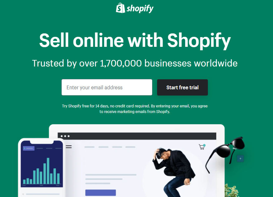
Top features:
- One-form field: only requiring an email address to get started is a very simple and timeless process to get a visitor’s information.
- Heading and subheading: in combination, this works really well in highlighting how widely used Shopify is. Also, saying “trusted” instead of “used” by over 1,700,000 highlights its value
- Social proof & company logos: Quotation shows how easy it was for Chioma to build their brand with Shopify. The addition of company logos show wide usage.
Hubspot
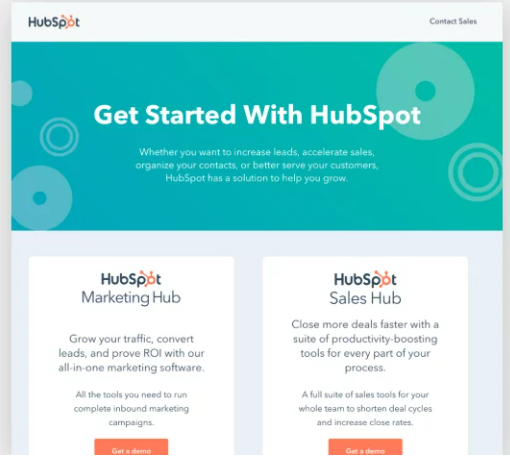
Top features:
- Segmenting its visitors with CTA’s: HubSpot is aware of their target buyer personas and as such, have decided to effectively split both marketers and sales team members with two different call-to-action buttons.
- Headings focused on visitor preference: Whether marketing or sales focused, HubSpot expresses the benefits of their system for both crowds in a concise manner that covers all their important points.
Unbounce
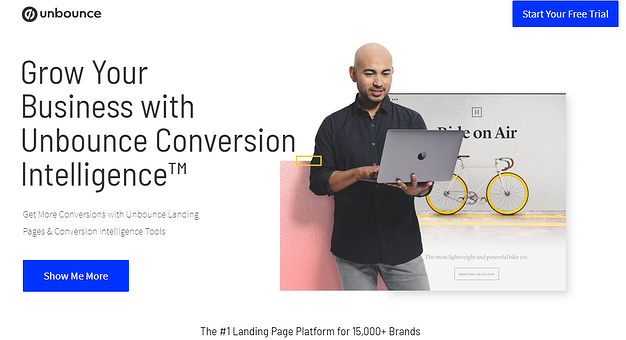
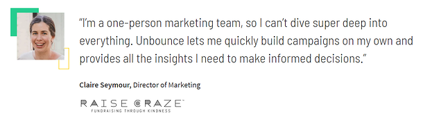
Top features:
- Action-driven heading: specifically targets what Unbounce is offering
- Action-driven copy supporting heading: specifies the benefits of using Unbounce’s Landing Page tools and Conversion Intelligence Tools
- Hero image: The simple image of the man holding a laptop shows that Unbounce can help you make powerful landing pages easily in the palm of your hand.
- Social proof: Quotation from Raise Graze helps solidify company success and enhances trustworthiness.
- CTA: follows as you scroll down the page so you don’t lose sight of it
Dropbox
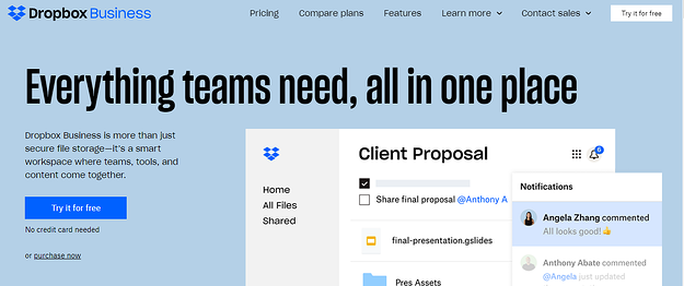
Top features:
- Engaging heading: perfectly and concisely captures what Dropbox is all about
- Attention-grabbing hero image: Prevalent hero image that shows an insight into how Dropbox works
- 2 CTA’s: The “Try it for free” CTA’s at the top of the page and on the left with the additional text “no credit card needed” helps alleviate the stressful decision of whether to use the tool or not.
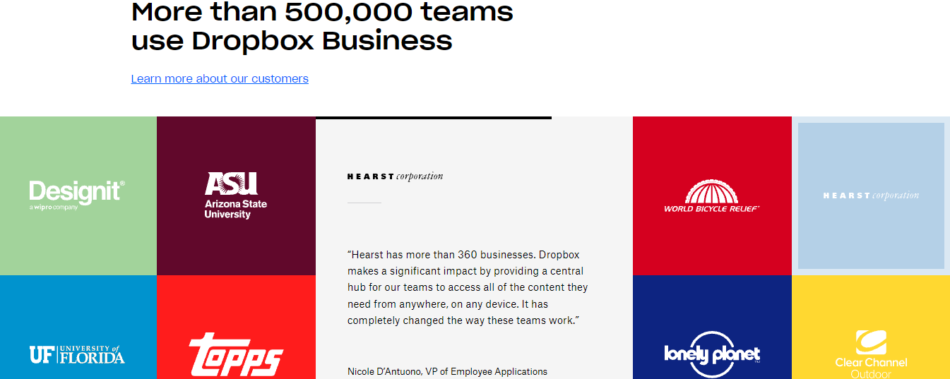
- Social proof: Quotations, company logos and star ratings show how trusted the company is and how effective the application is.
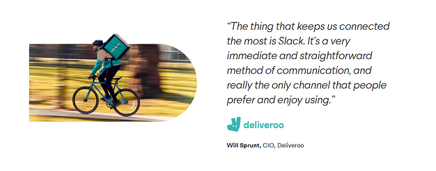
Slack
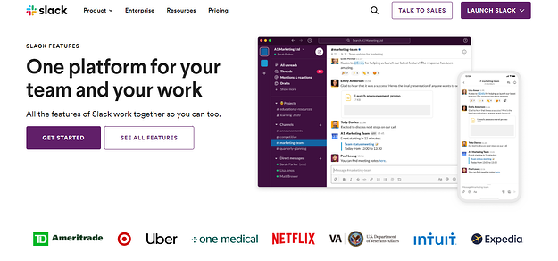
Top features:
- Informative heading: Text shows the initial benefit of using Slack – making teamwork easier. This is supported by the additional text underneath the heading.
- Clear CTA: The purple colour stands out against the white very well here.
- Social proof: Direct quotation highlighting the benefits of Slack and how it has helped Deliveroo and their teamwork efforts.
- Company logos: Emphasises how trustworthy the application is for several companies.
Best landing page examples – B2C
Grass Roots
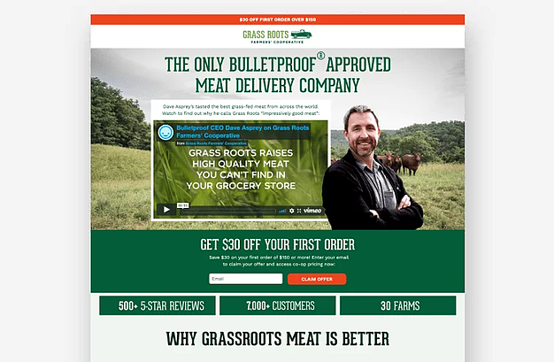
Top features:
- Hero video: Effectively captures the values of the business and how they operate. Very helpful in building trust and a strong relationship with visitors.
- One-field form: By simply entering your email address, you’re entitled to receive a $30 discount. Negates the stress of trialling GrassRoots
- Orange CTA: Clearly stands out from the rest of the page, action-driven language used here
- Strong social proof: Advocating their 500+ 5-Star Reviews with over 7000 customers, GrassRoots effectively show why their business is worth using.
Fast Mask
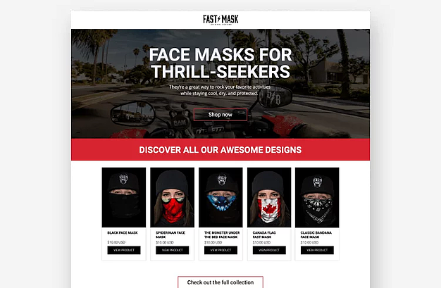
Top features:
- Engaging headline: Fast Mask understands the demographics of their buyer personas and appeals to the headline to suit bike riders and their thrill-seeking trait.
- Supporting copy: Simply and effectively highlights the benefits of wearing their masks, specifying health benefits as well as looking cool
- Highlights best-selling products: Although Fast Mask has a huge range of masks, they choose to show their best-selling lines to give you a sense of their diversity in designs. Could also give visitors a feeling of FOMO.
Airbnb
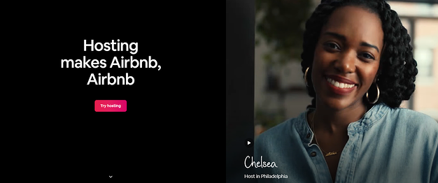
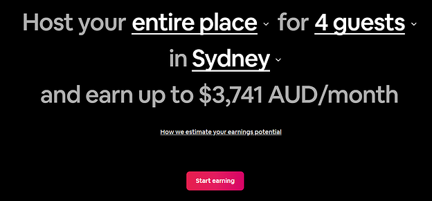
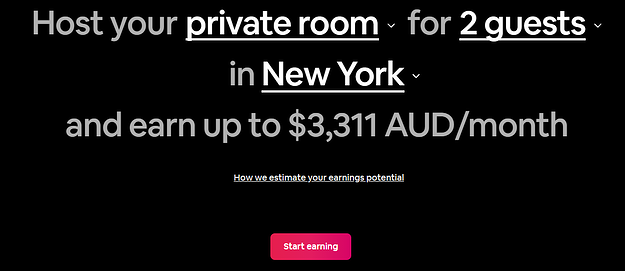
Top features:
- Hero video and headline: Having multiple hosts in different locations around the world present their homes with a smile heightens Airbnb’s welcoming nature. Advocating real hosts builds trust with visitors
- Directional cues: Adding a downwards arrow to signal visitors to scroll down further invites them to learn more about Airbnb
- Interactive calculator: By selecting room type, the number of guests and location, visitors can see an average price they could be earning if they were to host their residence.
Lyft
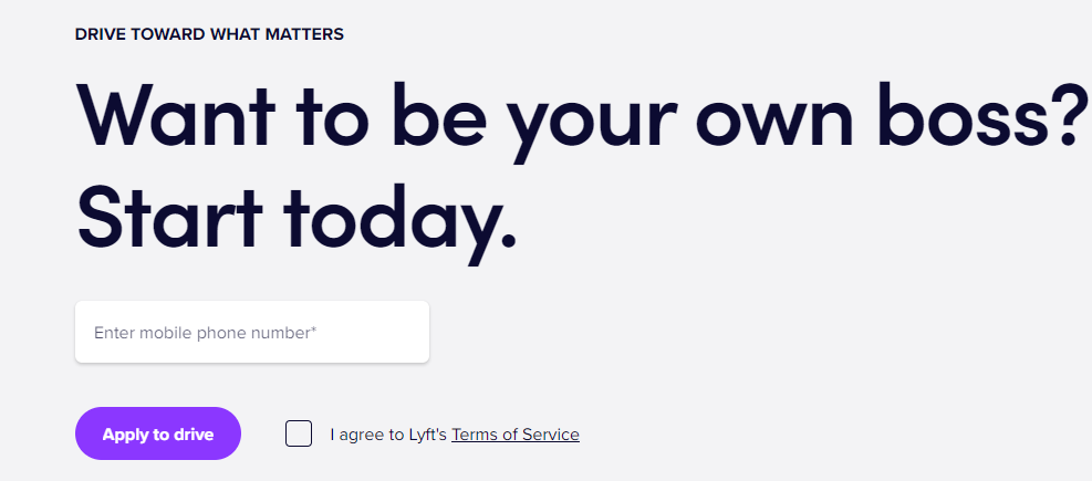
Top features:
- Engaging headline (featuring rhetorical question): Headline promotes the alternative for visitors to be their own boss, proposing a rhetorical question to stimulate critical thinking.
- One-form field: Just by entering your phone number you’ve started the process of becoming a driver
- Clear CTA: purple colour stands out from the rest of the website
- Social proof: highlights how this employee is able to balance their life a lot more productively by working as a driver with Lyft.
Lite n Easy
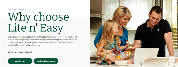
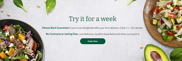
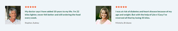
Top features:
- Hero image: Lite n Easy here is supporting the ideology of healthy eating not only promoting your way of life but benefiting family life as well with a photo of a happy family.
- Dual CTA: Lite n Easy recognise the majority of their target buyer personas are aiming to do two things, either lose weight or have more convenient meals on hand. Having two separate CTA’s to segment the two personas is very effective in solving a visitor’s pain point.
- Strong social proof: Star ratings with quotations work incredibly well together to highlight just some of the benefits different customers have had from using Lite n Easy. Very powerful in building trust with target audiences.
Best landing page examples – SaaS
Wistia
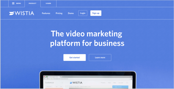
Top Features:
- Simple page design: There’s not much here to distract visitors from bouncing out with its simple design
- Bold CTA: clear and stands out from the rest
- Effective heading: Directly highlighting who Wistia is targeting and what they do
- Hero image: a great example of what’s known as a “fold teaser”, an image that encourages further scrolling, and this is due to the majority of the image being cropped out.
Zoom
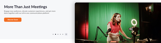
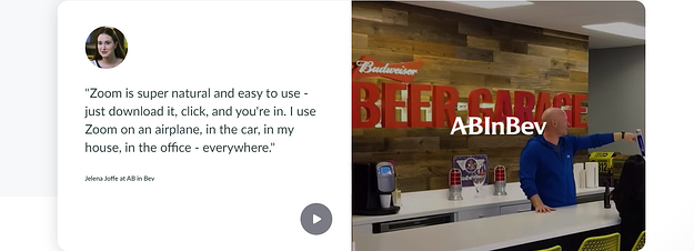
Top features:
- Several hero images: allowing Zoom to show the flexibility in the software, whether it’s for personal use or business.
- Bold CTA: the orange CTA is clear and stands out here. Action-driven language is also used to encourage visitors to learn more about how Zoom can benefit them and solve their pain points.
- Social proof: The quotation here emphasises from a customer’s point of view how Zoom has enabled flexible working conditions. The additional image of the business helps like-minded visitors feel a sense of belonging and help strengthen the relationship with the company.
Salesforce
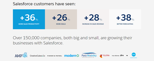
Top features:
- Unique Selling Proposition in Headline: Salesforce effectively highlights what their system helps businesses do whilst advocating they’re the best in the market.
- Ticks instead of dot points: Might be little, but this helps visitors envision Salesforce and how the system can help them in the form of a checklist. Does it give teams a shared view of every customer? Yes. This helps cement the benefits of using Salesforce
- Hero image: easily conveys the extent to how Salesforce helps its customers
- Strong social proof: Showing statistics along with company logos enables visitors to envision how these companies have benefitted from Salesforce and can paint a picture of how the system can help them directly.
SurveyMonkey
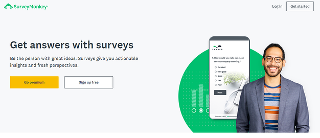
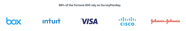
Top features:
- Benefit-driven heading: Directly shows visitors how the system benefits users.
- Advantages of SurveyMonkey paired with form: having these two types of copy side-by-side can help prospects whilst completing the form revisit why SurveyMonkey is beneficial for them.
- Strong social proof: Despite lack of quotation, mentioning that 98% of Fortune 500 companies rely on the system shows huge credibility highlighting that even the ‘big dogs’ use SurveyMonkey.
Lumosity
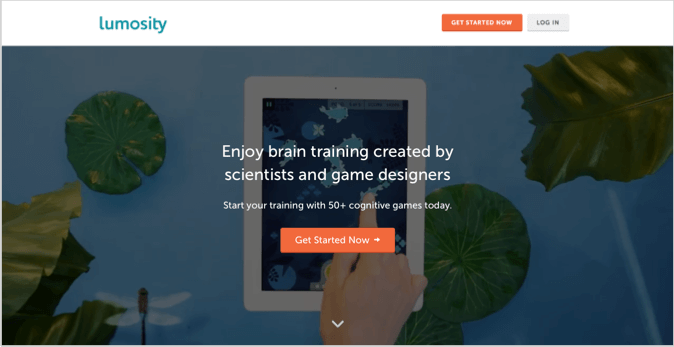
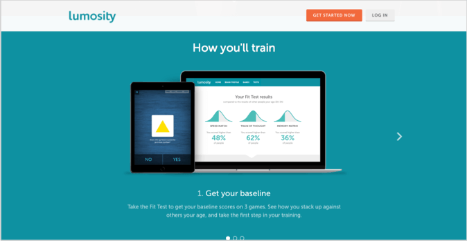
Top features:
- Engaging heading: Expresses that their brain training games are backed by scientific research, enhancing credibility
- Clear CTA’s: Bright orange to stand out and action-driven language used in “get started now”
- Directional cue: the arrow pointing down is a prompt for visitors to explore further and find out more about Lumosity and its brain training games
Best landing page examples – eCommerce
Squarespace
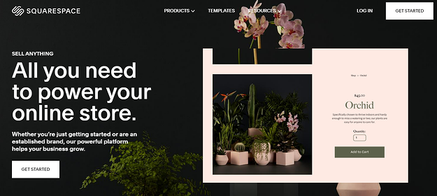
Top features:
- Engaging headline: Immediately notifies prospects that Squarespace has everything they need to start or improve their online business. The supporting text of “sell anything” helps entrepreneurs envision how they could use Squarespace their way to build their brand.
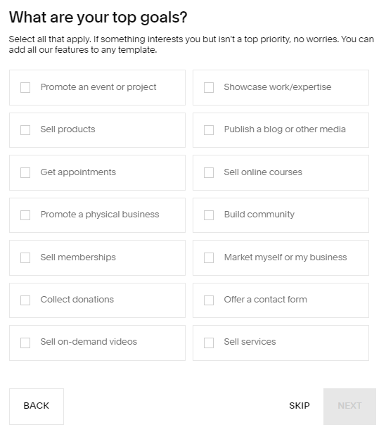
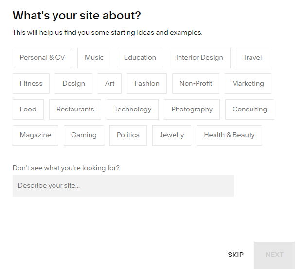
- In depth-form: This may sound hypocritical however it works in this context. Squarespace uses this particular form to display templates that they believe suit their visitor’s interests and vision. Whether the intention is brand awareness or to drive sales, Squarespace has a template to suit your needs.
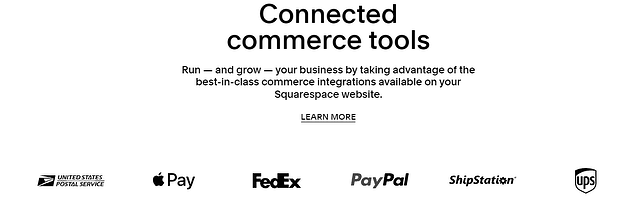
- Social proof: Adding the phrase “run and grow” with logos of successful companies helps strengthen the customer relationship.
Koala
Top features:
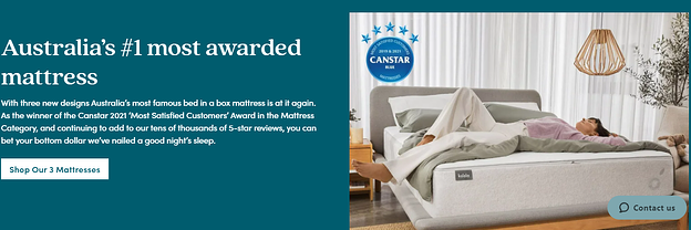
- Compelling heading: helps reiterate what the company sells and ensures customers of the high quality of their products
- Social proof: in combination with the engaging heading, the social proof helps support this with multiple reviews from happy customers expressing their delight with the product
- Canstar award: this further supports Koala’s claim as Australia’s No.1 mattress as they have been recognised and awarded by Canstar for it. This helps build trust and reinforces the high quality of product.
Peloton
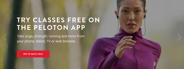
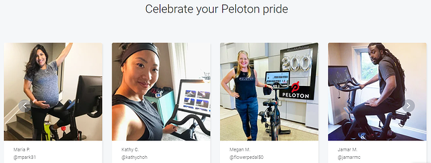
Top features:
- Hero imagery and video: fast-paced snippets showcasing the peloton range help prospects visually see how the company can help them
- Engaging heading: “game-changing cardio” → almost saying to customers that the way you were doing cardio before is either boring, inefficient or ineffective, but get results with Peloton.
- Strong social proof: having images of happy customers using the products is a very impactful way of persuading consumers into purchasing, rather than just having reviews (a picture is worth a thousand words)
Pedigree
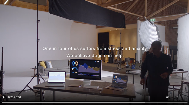
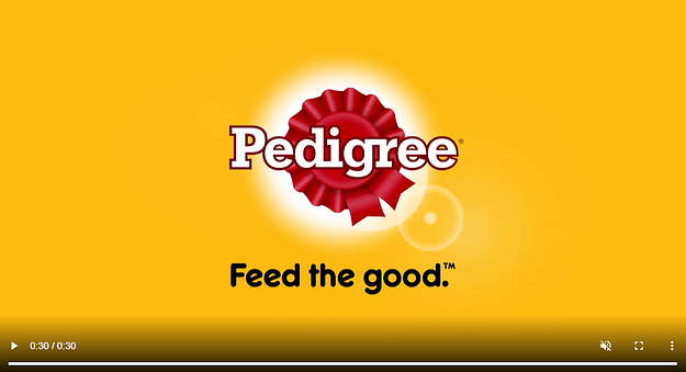
Top features:
- Very compelling hero video: showing the effects that a workplace injury had on an individual, which later affected them mentally (anxiety and depression) and how having a pet helped the man to overcome his health issues.
- Strong social proof: adding on from the hero video, it also exhibits very strong social proof as a visitor can visualise how owning a dog has helped a customer’s lifestyle.
Asics
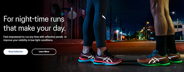
Top features:
- Catchy heading: stimulating comfort with exercising at night
- Unique Selling Proposition: of the reflective panels to improve visibility in darker conditions
- Targets a pain point: for busy individuals who work during the day and don’t have time to run in lighter conditions.
Best landing page examples – Not-for-Profit
World Vision
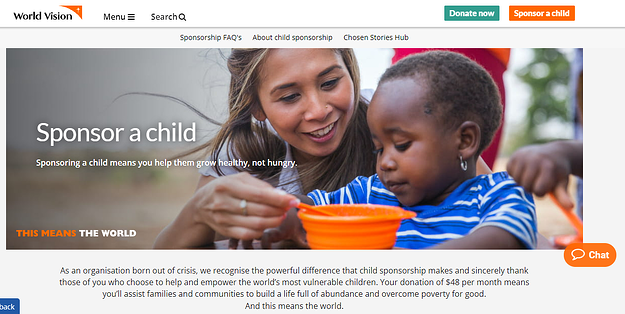
Top features:
- Strong heading + compelling copy: addressing the pain points that underprivileged children endure and how you can help. Also highlights how your donations help (how the solution works)
- Hero image: the picture supports how the solution works (your donations)
- CTA top right: follows as you scroll down the page to ensure visitors don’t lose the call to action.
Salvation Army
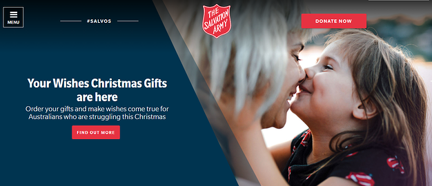
Top features:
- Compelling heading and copy: showing how your donation will help those in need
- Hero image: supports the heading and copy, having an image of a happy mother and daughter powerfully captures how much of a difference your donations make to those less fortunate.
- Bold CTA’s: The red colour contrasts the rest of the website, standing out clearly for customers who want to donate or find out more about the Salvation Army.
Vinnies
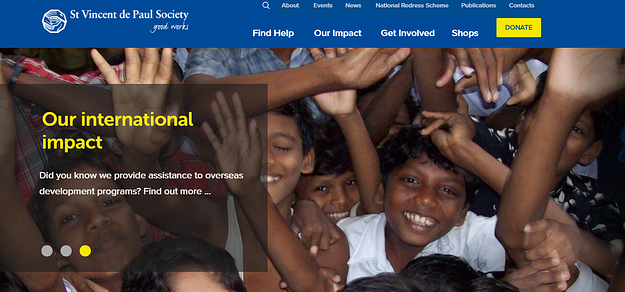
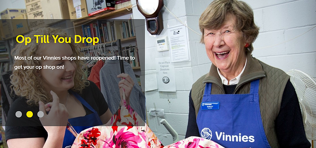
Top features:
- Hero imagery: Having multiple images helps show visitors exactly how the St Vincent de Paul Society (Vinnies) support underprivileged communities.
- Clear CTA: after visitors view the hero imagery, the bright yellow donation button is clear and stands out if prospects want to act
Charity: Water
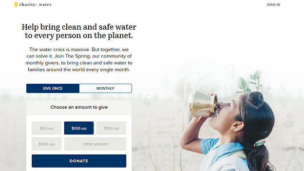

Top features:
- Action-driven language: Evident in both the heading and supporting copy, this landing page immediately informs you of what this business does and how you can help using language to encourage donations such as “together, we can…”
- Hero image: Visually shows visitors the tangible benefit of donating to this worthy cause
- Social proof: Helps build a trustworthy relationship with the charity whilst also showing how other donators have seen the impact their donation has on the cause, thereby increasing credibility.
Cancer Council
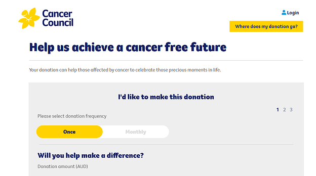
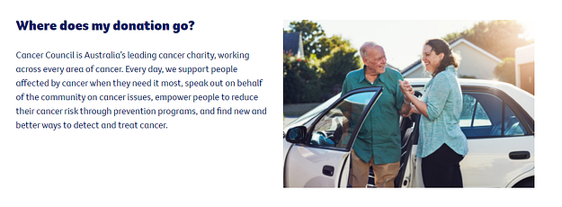
Top features:
- Engaging heading: the use of ‘us’ helps promote teamwork, expressing that together with your donation, Cancer Council will be closer to achieving their goal
- Powerful CTA: Cancer Council here removes any doubt as to where your donations go towards by having a bold, clear CTA that redirects visitors to the bottom of the landing page, answering their query.
Best landing page examples – Finance
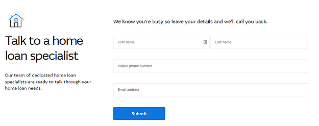
Rams
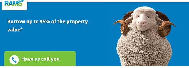
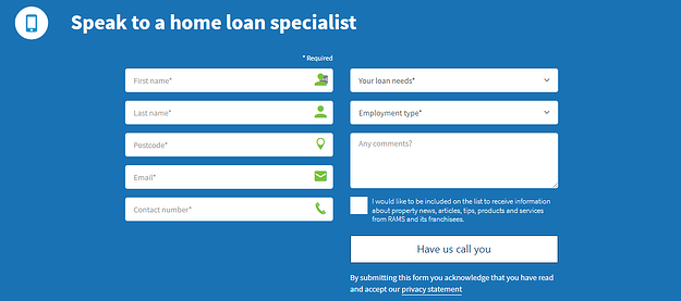
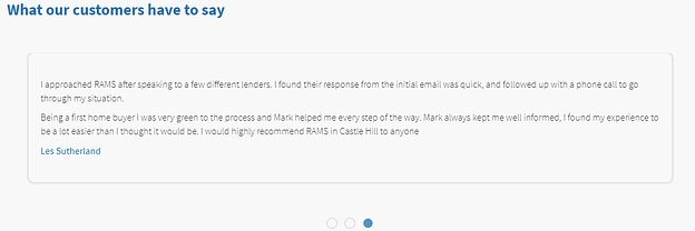
Top features:
- Incentive-driven heading: A clear heading with an incentivising offer as the heading immediately grabs the attention of visitors upon landing on this page
- Unique CTA: “Have us call you” is an awesome CTA to use as it removes the stress of the prospect making the first move. Rams make the home loan process much simpler by starting the discussion.
- Inclusion of icons in form fields: By simply adding icons Rams helps visitors avoid any confusion with form completion, ensuring they can obtain quality leads
- Social proof: helps visitors relate to the customer’s pain points, building trust with the lender.
Mortgage Choice
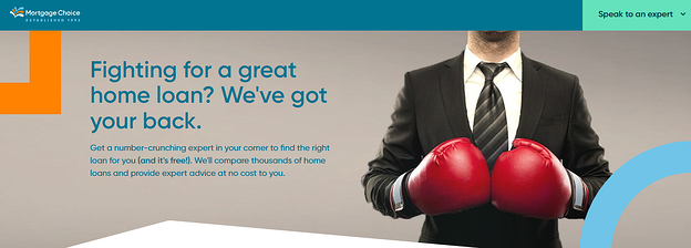
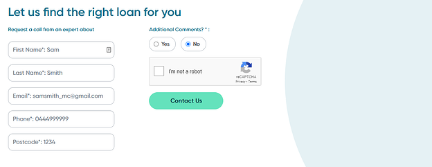
Top features:
- Heading & hero image: a play on words that addresses that finding a home loan can be difficult – like a fight and that mortgage choice will be in your corner through every step of the process.
- Action-driven CTA: “Speak to an expert” is a great action-driven CTA given the industry where customers are reliant on expert information, helps customers believe they are talking to knowledgeable employees, building trust.
- Social proof included
- Simple form fields: with the inclusion of “example texts”, Mortgage Choice similar to Rams and their icons, help avoid confusion for visitors.
Athena
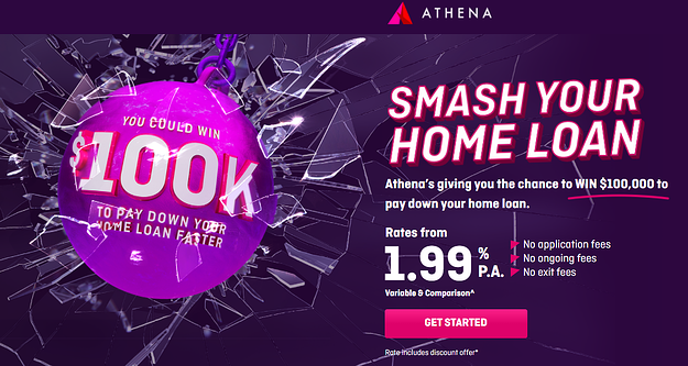
Top features:
- Strong hero image: Very apparent, grabbing your attention almost instantly. From the get-go, you are aware of what Athena is offering
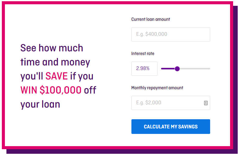
- Interactive Calculator: a great incentive for visitors to see how much they can save with Athena and act on it accordingly
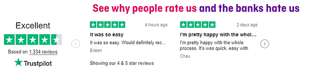
- Strong social proof: The inclusion of Trustpilot shows validity and credibility in reviews, reinforcing that these reviews are not fake and Athena is a trusted finance company.
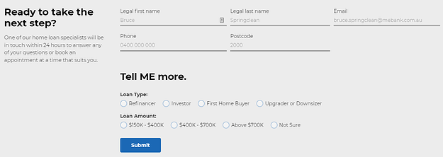
ME Bank
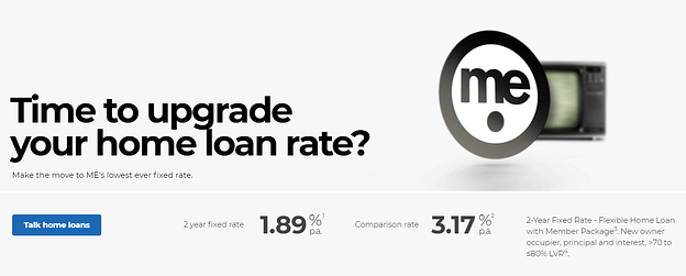
Top features:
- Rhetorical heading: having the heading as a question can help visitors reflect and review if they need to (in this case) upgrade their home loan.
- Supporting copy: The addition of their lowest rates (2 year fixed rate 1.89% p.a. & Comparison rate 3.17% p.a.) helps support their heading
- Clear form fields: having options of loan type and loan amount so the company can properly screen and segment their audience to target them with the right home loan
Macquarie Bank
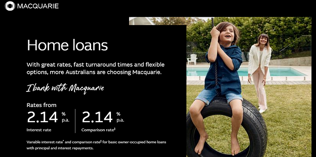
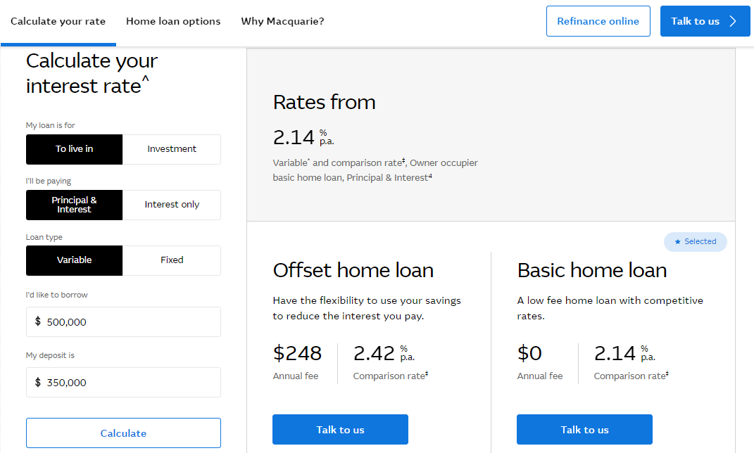
Top features:
- Hero image: helps reinforce that your financial decision is for the happiness of your family (per the child on the swing)
- Interest rate calculator: The function to calculate interest rates allows visitors to see their potential interest rates within seconds per their pre-filled criteria
- Simple form fields
Best landing page examples – Healthcare
HCF

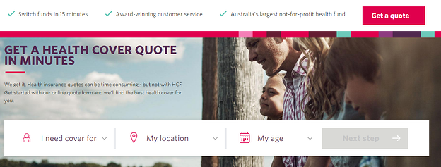
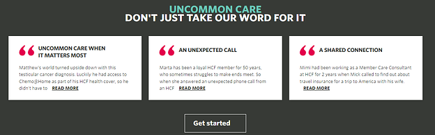
Top features:
- Hero image: supports the idea that looking after yourself is beneficial for you and your family
- Simple form field: being able to see what your potential health cover quote can be
- Social proof: in this case, the company shares their “success stories”, almost motivating visitors to join so they can be successful too.
Bupa
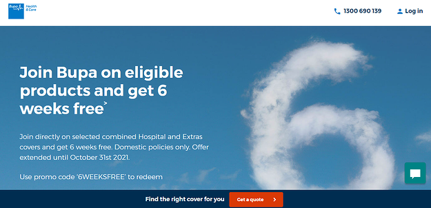
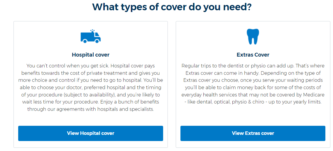
Top features:
- Incentive-based heading: From the get-go, visitors are informed of Bupa’s offer upon joining their cover options.
- CTA follows you as your scroll down the page, avoiding misplacement and losing potential conversions
- Segmentation of target personas: Bupa understands their main target persona’s pain points of either wanting hospital or extras cover and as such, have divided the necessary information to make it easier for visitors to educate themselves on the cover they want.
AHM
Top features:
- Simple but effective hero image: cartoons help enforce that finding health insurance is easy and straightforward, like drawing a cartoon
- Clear Call To Action: stands out from the copy, avoiding mislocation
- Inclusion of chatbot function: helps visitors find out more health insurance info avoiding the time spent calling the company
Medibank
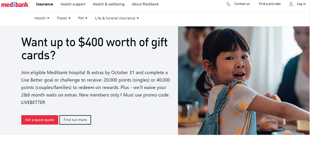
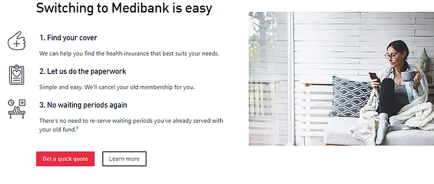
Top features:
- Hero image: enforces that your health decisions is not only beneficial for you but for your loved ones also
- Addition of a crucial pain point with supportive CTA: Addressing the potential problem of switching health providers shows Medibank understand their target audiences situation – adding “get a quick quote” supports how easy Medibank can make the process of switching providers, alleviating the stress of a crucial pain point
(Bonus!) Know exactly what metrics to measure the performance of your own landing pages
Wow, you’ve made it this far, congratulations and hopefully you’ve enjoyed the blog thus far. As a reward, here are some of the metrics that you must measure to have landing page success in 2022:
- Bounce rate
- Landing page views
- Average time on page
- Traffic source
- Conversion rate
- Pages per session
- Heat mapping
The most important landing page metric many marketers consider is conversion rate. However, conversion rate is an umbrella metric as there can be many reasons as to why your conversion rate is either lacking or performing well.
Measuring your metrics might show whether or not your landing page is performing well. If it is, great! If not, what can we do to improve it? The following landing page metrics must be considered when defining the nature of your landing page success.
Bounce Rate
One of, if not the most important landing page metrics is the percentage of visitors that leave your website without visiting a second page. A “bounce” is a single interaction on your page so for example, if a visitor lands on your landing page and leaves without submitting a form or leaves before reaching your “thank you” page, that’s a bounce.
With that in mind, what’s an ideal bounce rate for your landing page?
RocketFuel segments a good bounce rate for landing pages into three categories:
- Excellent: ranges between 26 – 40%
- Average: ranges between 41 – 55%
- Decent: ranges between 56 – 70%
Anything higher than 70 per cent for a specific landing page is considered poor and as such may require fine-tuning, but what exactly could a high bounce rate mean? It could mean four different things:
- Your audience is not connecting with your content
- Your content is of poor quality. There’s nothing enticing visitors to explore further
- Visitors found what they were looking for and left.
- There’s a mismatch between what users thought they were going to see and what they’ve actually landed on – review your ads
Having a high bounce rate may not entirely be your fault, however it’s worth keeping an eye on your content to make sure it’s still relevant to your audience so they can connect with you and the business.
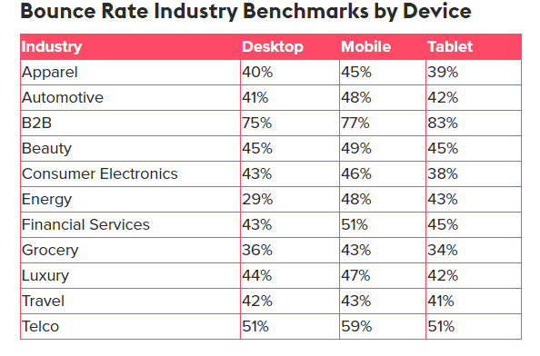
Here’s a rough benchmark of bounce rates per industry comparing the desktop, mobile devices and tablet from Contentsquare:
Landing page views
Another important metric to keep tabs on is the number of times your landing page is viewed. A nifty side-benefit of seeing your landing page views is that you can view the time the customer clicked onto your landing page, so if you’re running a PPC campaign, you can set your campaign to be delivered during these times to help boost sales and landing page success.
Source: Databox
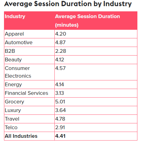
Average time on page
This statistic helps you get a grasp of whether or not your content is hitting the spot with audiences. A low average time on page score may require you to update your content on your landing page. Vice versa, the longer the visitor spends on your landing page, a better conversion rate usually follows.
Contentsquare once again provides us with some industry benchmarks for average time on page:
Traffic Source
Monitoring where your traffic is coming from is very important as it can allow you to understand firstly, how your traffic is clicking onto your landing page, but secondly, evaluate whether your content is applicable to the visitors bouncing in, especially if they are converting into leads the most.
Cyfe does a great job in breaking down the main traffic sources:
- Direct traffic: visitors who directly typed your URL into their browser
- Referral traffic: visitors who found your landing page by clicking on a link from another source
- Social media traffic: visitors landing from a social media post – this can be further broken down by which social media platform
- Organic traffic: visitors landing on your page from their search queries on Google, Bing etc.
- Email traffic: visitors who engaged in one of your email marketing campaigns and bounced onto your page
- Pay-per-click traffic: visitors who clicked on PPC ads to land on your page
Assessing which channels bring in the most engaged, highly-converting visitors can support you in your efforts to optimise your page and drive more conversions.
Conversion rates
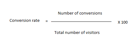
The percentage of visitors that take the desired action on your landing pages determines your conversion rate. Depending on your landing page, the desired action could be buying a product, filling out a form or clicking on a link and setting up a ‘thank you’ page can help measure these conversions much easier.
We can simply calculate conversion rates by dividing the number of conversions by the total number of visitors and then multiplying by 100 to get the value as a percentage, as shown below:
From there, you can compare your conversion rate with your industry average for most landing pages and see how well you’re performing:
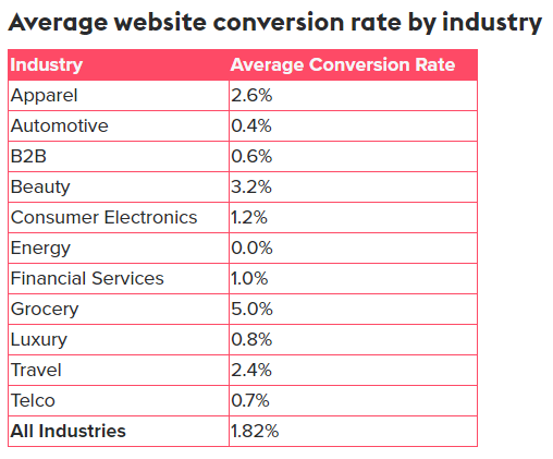
Source: Contentsquare
If your conversion rate is falling short compared to industry standards, check out our conversion rate optimisation guide to supercharge your website.
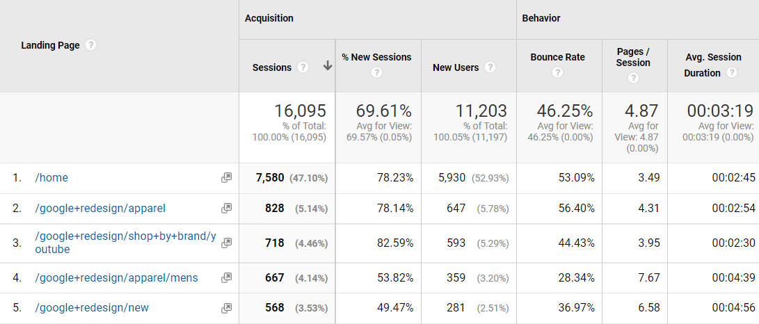
Pages per session
This metric offers valuable insight into whether customers are getting the information they need to make an informed decision.
If you have a high number of pages per session, this could be a sign that users either:
- aren’t ready to convert when they land on your page, or
- they didn’t get enough information from your landing page
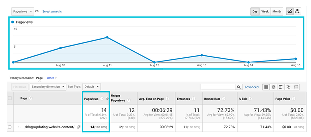
Track your pages per session in Google Analytics by navigating to Behaviour > Site Content > Landing Pages. From here, you’ll be able to find the pages per session for all of your landing page content:
Heat mapping
Heat maps are one of the most insightful tools you can use if you want to understand how people are interacting with your landing page.
Heat maps and scroll maps show which parts of the page users are clicking on, which sections they ignore, and how far they scroll down your page. For example, in this heatmap we can see that users are most focused on the case study on the right-hand side:
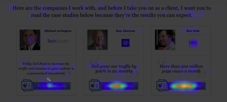
Image source: Crazy Egg
This might be because this is where users are naturally drawn to, or because that case study is the most powerful of the bunch. These insights could then be used to strengthen engagement on the landing page by either creating similar case studies, or placing the most important information there to maximise clicks.
Website recording is another handy tool to have in your arsenal. Use these to see where a user’s mouse moves as they browse through your page, where they pause and stop scrolling, what information they miss, what they click on, and how they fill out your forms.
Landing page optimisation tools like CrazyEgg and Hotjar have plenty of heat mapping features that you can use to track visitor behaviour or run an A/B test.
Why is monitoring these key metrics important to your business?
To know your ideal audience – the misalignment between company and visitor
According to Time magazine, content producers only have 15 seconds to gain their reader’s attention, that’s an incredibly short amount of time. Aligning the customer’s needs and desires with what people have clicked on, will drastically increase your numbers in:
- Average page time: readers will be more inclined to read the content that meets their needs and satisfies their pain points
- Conversion rate: as your satisfied reader would be persuaded to engage with your company further.
By measuring your landing page metrics, you will be able to focus your content and business positioning to satisfy your target audience better. Knowing your ideal customers and their pain points will allow you to provide them with more relevant information in the hopes of triggering more conversions.
Patch the holes in your user experience
As much as I like swiss cheese, if there were fewer holes in it I’d be able to enjoy more of it. This logic can be applied to your landing page, with your page being the cheese and the different reasons for visitors leaving being the holes. Some examples of reasons why your visitors leave your site could be due to:
- The copy not connecting with your audience
- The visitor not completing your form due to its complexity
- No clear CTA button
- And many many more
Measuring the key metrics can allow you to see where your page is suffering and can show how you can rectify the user experience. Moral of the story: don’t have too many holes otherwise there’ll be no cheese to enjoy.
Making the most out of your investment
Sounds obvious, doesn’t it? By simply knowing your ideal audience and patching the holes in your user experience, you will inevitably generate more conversions to your website, which can turn into more leads and ultimately, more sales.
More sales means more money, gotta love that!
Assessing where your landing page isn’t quite hitting the spot can allow you to shape your ad copy and layout of the page and make it a well-oiled machine. By well-oiled machine, we simply mean getting the most out of your marketing investments.
By considering every important element of your web pages, taking note of the best landing page examples, you will be able to create a successful, high-converting landing page to take control in 2022.